#index #design
# Frutiger Aero

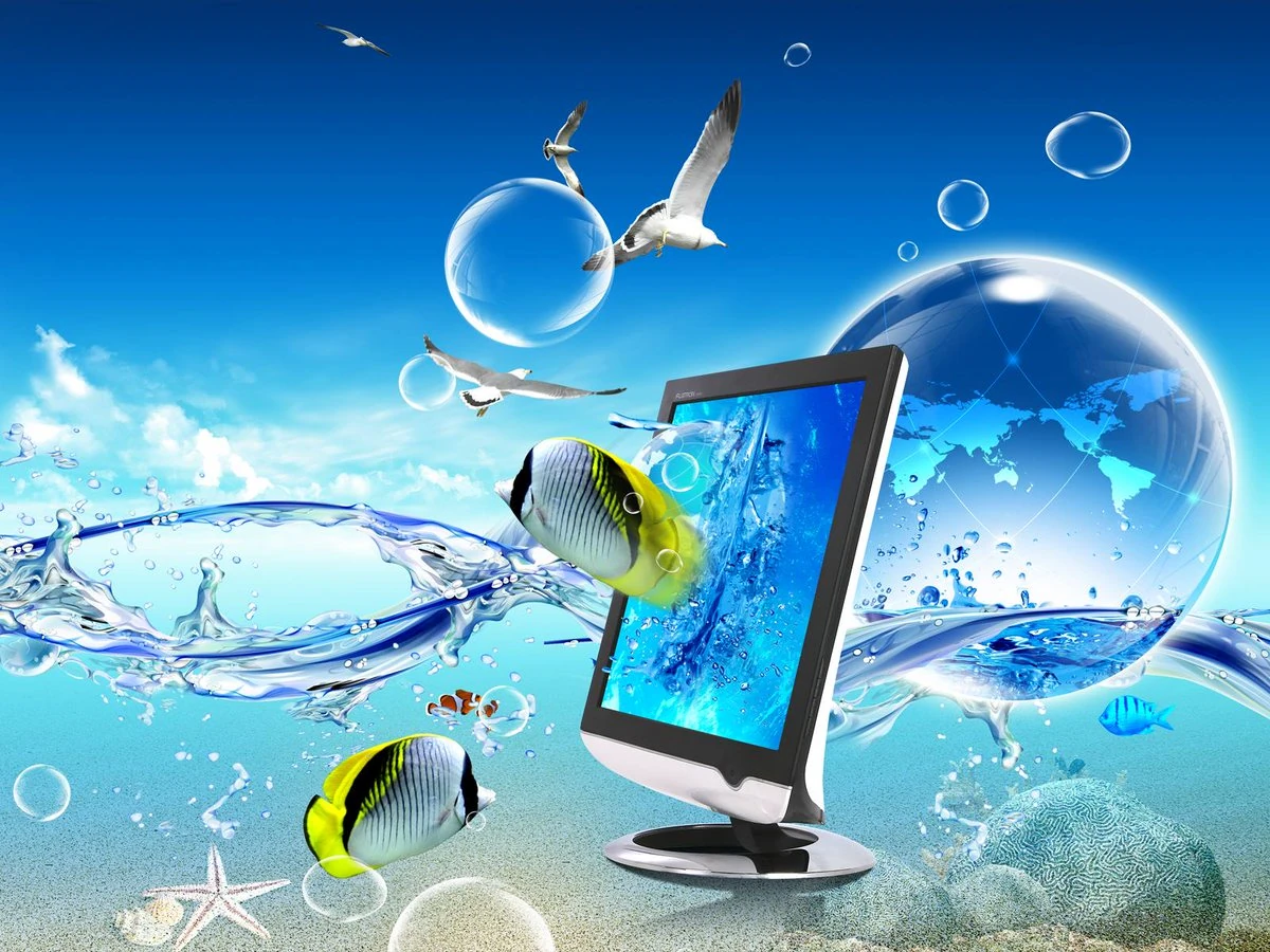
A visual aesthetic named after Adrian Frutiger (the creator of the Frutiger font) used in corporate branding used in the mid 2000s to early 2010s (2004-2013). It is characetersized by [[Skeuomorphism]], glossy textures, humanism, water, bubbles, auroras, bright and vibrant tertiary coors and glass. These designs were meant to evoke a sense of hope and optimism in the viewer. Probably the best example of this aesthetic I can point to is the Windows 7 default desktop wallaper.

With the use of humanism and "friendly, approachable" design, people who were initially skeptical of technology decided to finally give it a try.
Frutiger Aero was eventually replaced by a more flat, minimalist design around 2013 with the release of iOS7 the iPhone5. Compare also to [[Corporate Memphis]] form the late 2010s to early 2020s.