**Tags :** #composition #lftm #perception #contrast #photography [[Diamond 7 - Creative IO]]
# Learning From **The** Masters : Andreas Gursky's banded composition
View fullsize

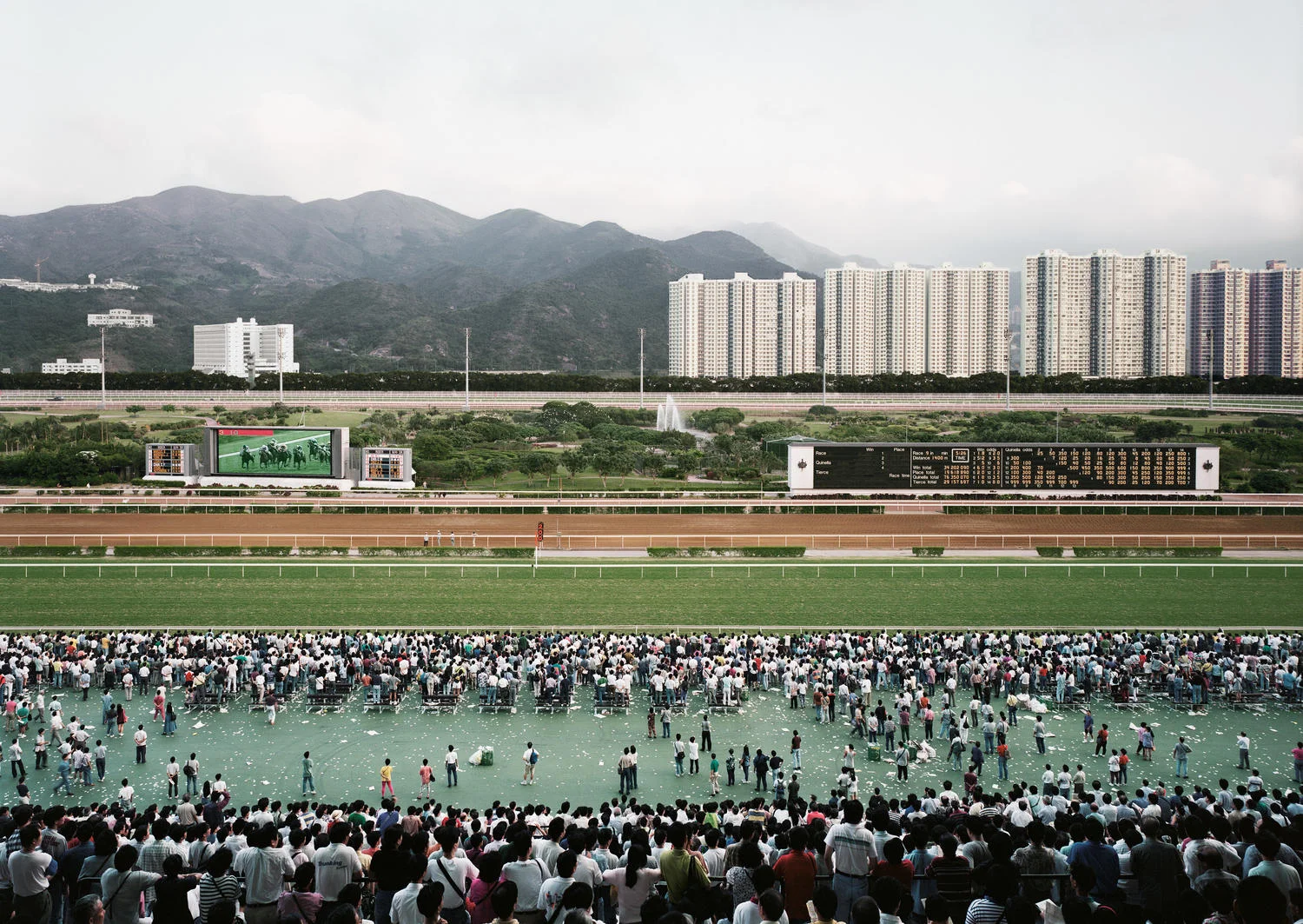
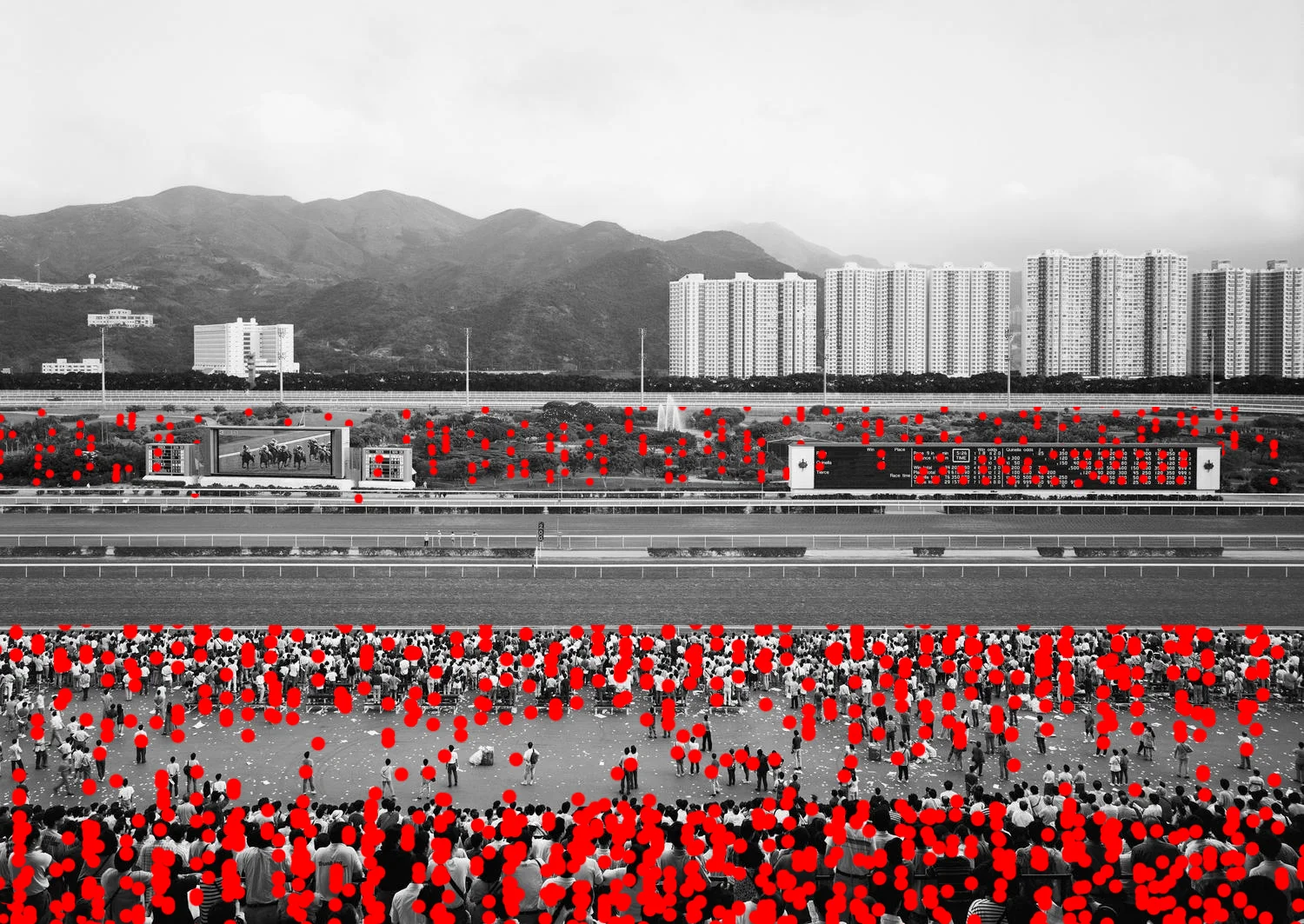
Gursky A. | Sha Tin | 1994
## **About the photographer...**
Andreas Gursky is a German photographer born 15 January 1955 in Leipzig East Germany.
After studying for a couple of years photojournalism, he applied to the Kunstakademie Düsseldorf where he followed the path of his tutors Bernd and Hilla Becher. The Bechers were the founders of the Dusseldorf School, mainly with their famous work of photographing industrial archetypes and gathering them in grid layouts. Although we can find influences in the early work of Gursky, he quickly built up his own style focusing on large architecture or landscape subjects with a bold use of colours.
Gursky’s work rely on strong composition principles as well as an outstanding density of details. His photographs are always printed in large scale (about 2 meters wide usually) which allows for the viewer to be drawn even more to the small details. This creates a quite weird experience because this overwhelming amount of detail creates a kind of uniseasiness for the viewer who can’t really stop information from entering his or her brain. Technically speaking, his images are sharpened irrespectively of how near or far an object is from the camera.
One of the distinctive characteristic of Gursky’s photographs is the point of view he chooses that creates an abstract perception although what it depicts is real. Instead of being in the scene, Gursky always takes a step back, and is usually quite high in order to get a totally different perspective on his subject, one that shows its truly massive scale, whether natural or man-made.
Another thing to know about the way Gursky operates is that, since the 90’s, he relies a lot on postprocessing. Meaning he takes many frames of the same scene, sometimes from slightly different point of views (for the neverending Montparnasse facade for instance) and recomposes them digitally. This informs us on a particular thing : if something is in the image, it means it brings something to the overall photograph, otherwise it would have been simply erased.
As we’ll see in the analysis below, the main feature of Gursky’s work is what we call Aggregate Space. A term used in social sciences to describe a whole made up of its individual parts. The maestria of Gursky relies in his ability to emphasize the individual parts and the whole at the same time, maximizing the visual weight of patterns, reiterated units, overly saturated colours, lines, symmetries, and forms.
Gursky's work was influenced by various photographers including Steven Shore for the banal scenes with bold depiction of colors, Jeff Wall for the contrast between natural beauty and urban decay, Bernd and Hilla Becher for the detached approach to the subject, or John Davies for the almost systematic resort to high point of view.
## **About the photograph itself...**
The photograph we're going to study now is called Sha Tin and was shot in 1994. The actual print is a chromogenic color print and is 180x235cm. It depicts a crowd on a race track in the bay of Hong Kong and, as we'll see, epitomizes all the main features of Gursky's best work.
## **Composition Principles**
View fullsize

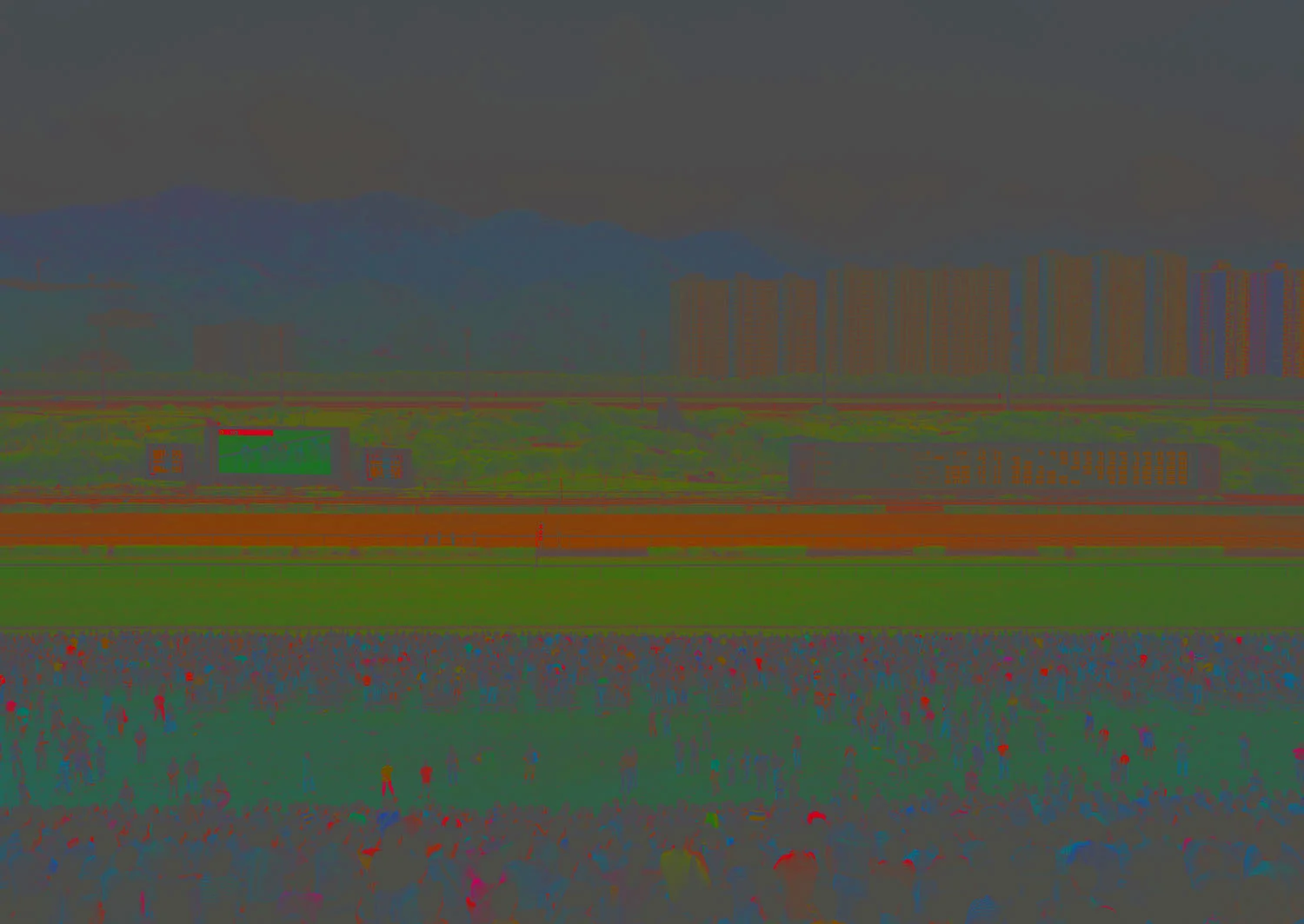
Same old same old, we can turn the image in black and white in order to better concentrate on the actual composition rather than the colours (which we’ll see, play a huge part in the perception of the image as well).
View fullsize

As mentioned in the presentation above, Gursky likes to take photograph from high point of view. This enables to not only capture a scene, but its surroundings and boundaries and what's beyond. In this way we can get a large part of the dense housing and the mountains in the background as well as the freeway. A lower point of view would have ended the perspective extremely quickly because of the crowds or the large screens.
In the case you're working with a client, rendering that are not at eye-level can feel unnatural. If you want to have a point of view from a higher area, try to keep it "realistic". In our case here, Gursky is obviously in the higher part of the tier.
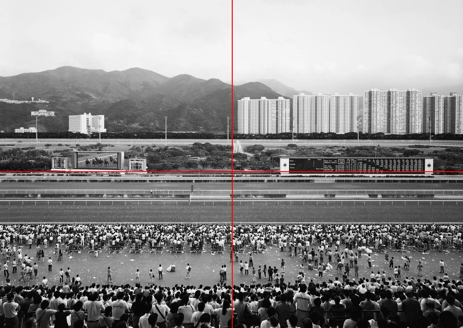
Interestingly, if we cut the composition in halves, we notice that the race track covers only the bottom half. The large screens sits perfectly on the middle of the composition, and the upper half is comprised of a green belt, the freeway, dense housing and the mountains.
Vertically, the dense housing stops exactly at half of the composition and find its natural mirror in the mountain on the left half.
View fullsize

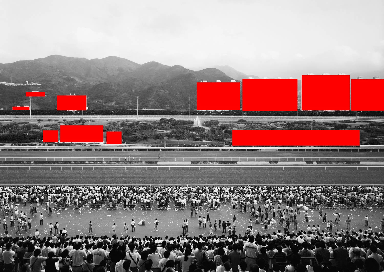
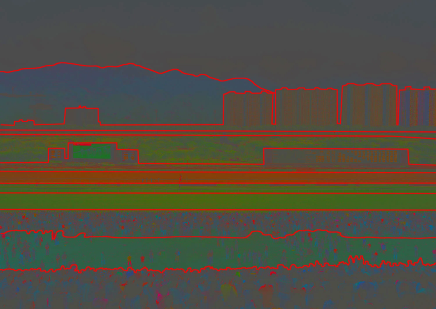
Although the photographic principle is quite obvious, it is interesting to tweak our image in order to emphasize the forms that compose the image. To do so, we blur the image to a certain amount so that we only get a glimpse of the different shapes and their weight in the composition.
Notice the well defined horizontal stripes that compose the image. Negative spaces appear in the second and fourth stripe as well aas at the bottom of the building in the background. We also notice differences in the density of each stripe. The dotted stripes in the background looks way more chaotic than the more calm landscape stripe of the racetrack and the infrastructure.
View fullsize

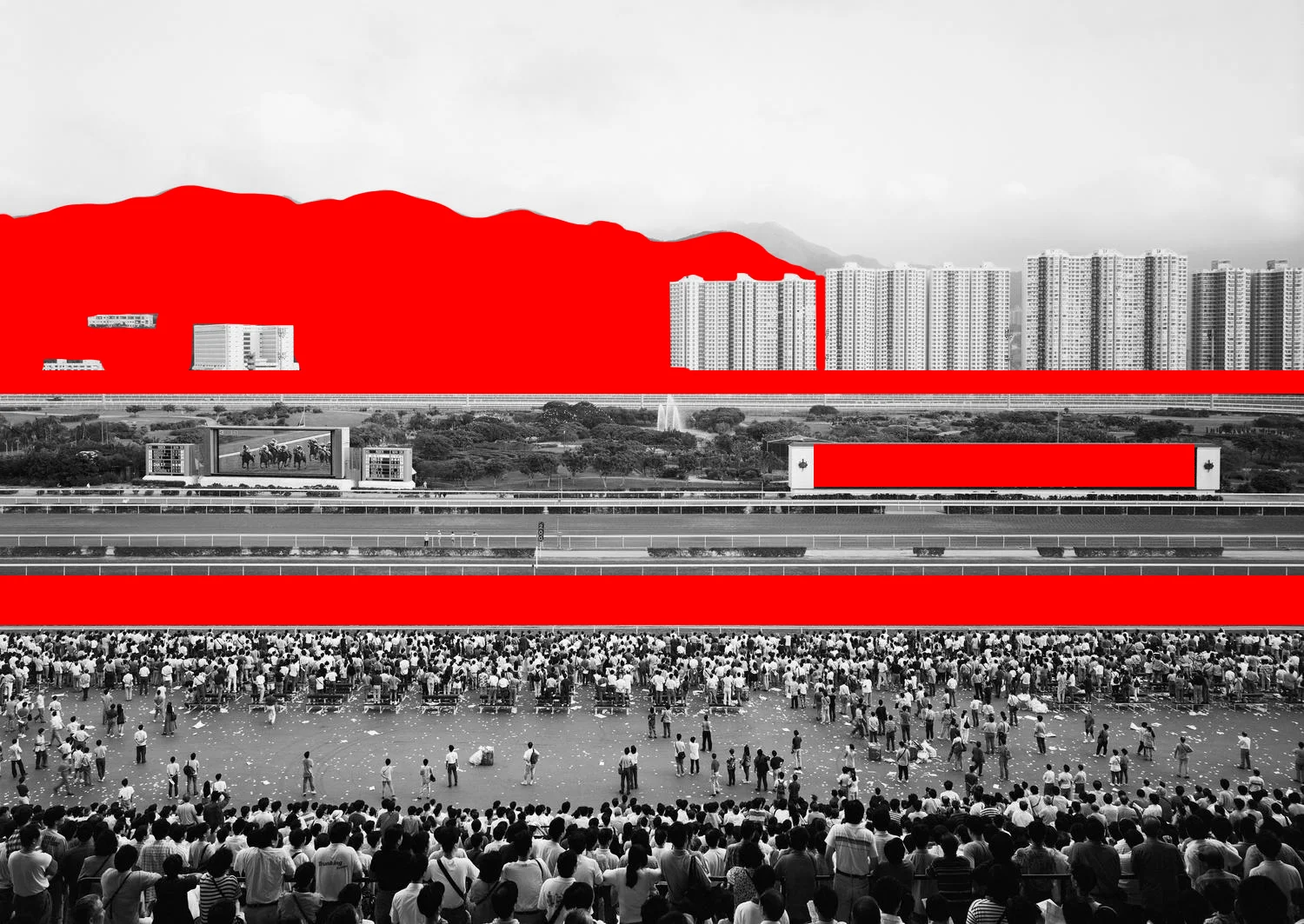
As you can imagine, taking your photograph from higher enables you to get much more depth in your image. Where your usual street level will give you 3 to 5 levels of depth if you’re composing it well enough, in this case we can count at least 11 different levels of depth.
- The crowd in the foreground
- The sparse crowd
- The more compact crowd
- The green area
- The hedges
- The race track again
- The Screens
- The green belt
- The freeway
- The dense housing
- The mountains
- There’s even a second plane of mountains faded out.
The interesting thing to keep in mind is that some of these stripes are not consistent and still appear consistent to us. For instance, the second stripe is comprised of a sparse crowd and the ground. This is not homogenous but it looks like a stripe because it is compressed between two extremely dense stripes of crowd. Same goes with the greenbelt which is not extremely homogeneous either, but is squeezed between two perfectly homogeneous stripes (freeway and racetrack).
A quick comment regarding the number of planes or the level of depth in an image. One thing to understand is that the more doesn't necessarily means the better, but the more definitely means the bigger. This means that if you're trying to convey the idea of large space (which is often what your client wants their spaces to look like), having several legible planes in your image is the way to go. In the case of this particular image, the banded composition sort of flattens the image. It still looks deep and big, but it would look even larger if the planes were sort of intertwining instead of being perfectly parallel. You can check the photograph [Monaco shot in 2004](http://www.andreasgursky.com/en/works/2004/monaco) that have more complex levels of depth, still from a high point of view.
There are different types of masses in the image. The first one is a light homogenous mass (the building and the screen), the second is a dark homogenous mass (the mountain and the racetrack). The third one is an interesting one because it is composed of hundreds of individuals. This compact crowd echoes the more sparse trees in the greenbelt, as well as the bright numbers on the screens, or the hundreds of black windows on the light facade of the housing in the background.
Gursky likes to photograph crowds. Since he always shoots from quite far away, the crowd always look like an anonymous mass especially in this case where it’s looking away, toward the giant screen and the race track. This can remind us of the _disanciation_ principle of Bertolt Brecht, and prevents us from feeling part of the image. This builds up the perception of otherness that Gursky often creates in his composition.
Is it something you'd want in your rendering? Not necessarily, but it is a good thing to be aware of the underlying feeling you're creating when working with large amount of people in your image.
View fullsize

Another interesting relation is the one opposing a single element to three equivalents. This is kind of like the rule of odd numbers which state that objects in a composition work better when in odd numbers.
In our case, Gursky frames single massive objects on the right with their counterparts on the left, in groups of three. It also works with the crowds which respond to the smaller group in the racetrack and the single individual next to the screen.
View fullsize

Although the image composition is about horizontal stripes, Gursky manages to use arrays of vertical elements to reinforce his composition. The white posts of the fence, the masts along the freeway, add up to the composition thanks to the even spacing on a perfectly horizontal line.
As we'll see now, contrasts, saturations and hues also play a huge part in the composition.
## **Hue, Saturation, Value**
View fullsize

On the image above you can see the levels of the overall image. Interestingly, the histogram doesn't imply such a strong contrast while when you look at the image you can find quite noticeable local contrast in the foreground or in the crowd more generally.
Since Gursky likes to keep a sharp image from the foreground to the background, the objects in the image keep a quite homogeneous contrast at least from the foreground to the high density building in the background. Only the mountain starts to fade and it is more due to the overcast weather and clouds rather than the distance itself. This sort of paradoxically flatten the image while we can grasp several kilometers of distance.
Coming back on the lighting topic, the flatten aspect of the image is also reinforced by the absence of direct lighting. The whole scene is lit by the natural light of an overcast, hence homogenous, sky. There are no particular cast shadows noticeable.
View fullsize

Gursky is a master in the use of colours in his composition. Not only does he rely on patterns composition wise, he also reinforces the patterns he’s playing with thanks to colours.
We got homogenous stripes, and in the crowds bright spot shows variations in saturations. Having these random spots of bright saturation in the crowd tricks the viewer in focusing shortly on specific areas of the image.
If we look at the hues now, we can see that the delimitation of the levels of depth matches exactly. Value, density, saturation and hues all contribute to the legibility of the composition principle.
In terms of colours, Gursky uses a simple palette that fits its stripe composition :
- Green for the different parts of the racetrack, the screen and the greenbelt
- Brown/Red for the second racetrack, the digits on the screen and the housing in the background and small touches for people clothing in the foreground.
- Blue for most of the crowd and the mountain in the background
# Deliberate Alterations
Gursky started digitally playing around with his images in the 90's. This is an interesting detail because it means that everything that is kept in his images is here for a reason otherwise it would have been erased in a second.
Let's play around with three aspects we highlighted in the article.
View fullsize

Here we're tweaking one colour in the whole composition, and it reads completely differently. The former brown stripe is now green. The effect is quite noticeable because your eyes don't stop anymore in the middle of the composition since everything is in green hues. The overall composition doesn't read anymore in two halves with the bottom half clearly defined by the brown stripe and the giant screens.
Basically the idea is that if you want to catch the eye of your viewer and make them stop for a millisecond, use a different hue in your composition. This also works if, like Gursky, you want to reinforce the legibility of the different planes of your composition.
View fullsize

For our next alteration, I erased a couple of elements to better show how the rule of odds and the pattern Gursky works with is important.
The buildings in the mountain, which were working composition-wise with the high density buildings on the right are erased. The pairing principle we had vertically doesn't work anymore and we end up with a simple opposition of the mountain against the high density buildings which, while it could still be interesting, decreases the effect of the pairing principle started with the screens, or the crowd and the smaller group, or the hedges.
View fullsize

For the final alteration, it is something obvious but it shows how important the foreground is.
Compositionwise, we lose one level of depth in our banded structure. We also lose contact with the ground because we feel much further away from the crowd than we actually are. Symmetrically, we also lose the mass effect the crowd had against the white sky which helped in anchoring the photograph.
### Let's stop here with the overall analysis of the image. For legibility sake, here's a quick breakdown of tips and tricks we, as archviz artists, can learn from Andreas Gursky's approach to aerial composition and implement in our daily worklfow.
---
## **Key Concepts**
- ### **Choose a high point in your site to have a view overlooking the whole area and its surroundings**
- ### **Emphasize the depth of your site by multiplying planes in your composition**
- ### **Use repetition and slight variations of the same unit to create a strong compositional element**
- ### **Use symmetry, patterns, lines and groupings in order to balance your composition**
- ### **Rely on extreme depth of field, where everything is razor-sharp from the foreground all the way to the background**
- ### **Keep a consistent contrast throughout the whole image**
- ### **Try to maintain minimal cast shadows (overcast skies, or shot around noon) to flatten the geometry**
- ### **Use hue and saturation to reinforce composition principle and differentiate the planes in your composition**