**Tags:** #article #process #photoshop [[Diamond 6 - Color]] [[Diamond 9 - Process]] #workflow #business
# The project
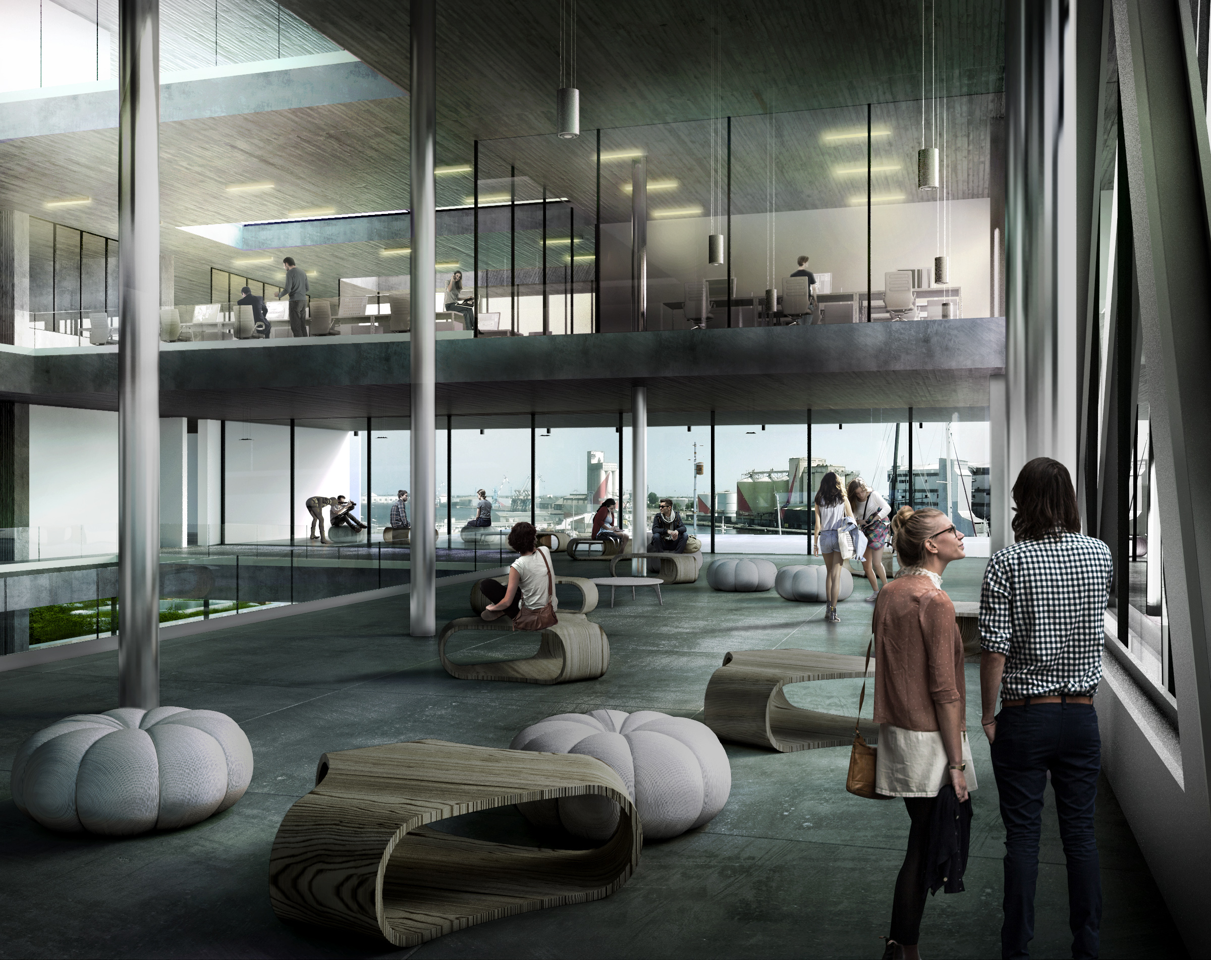
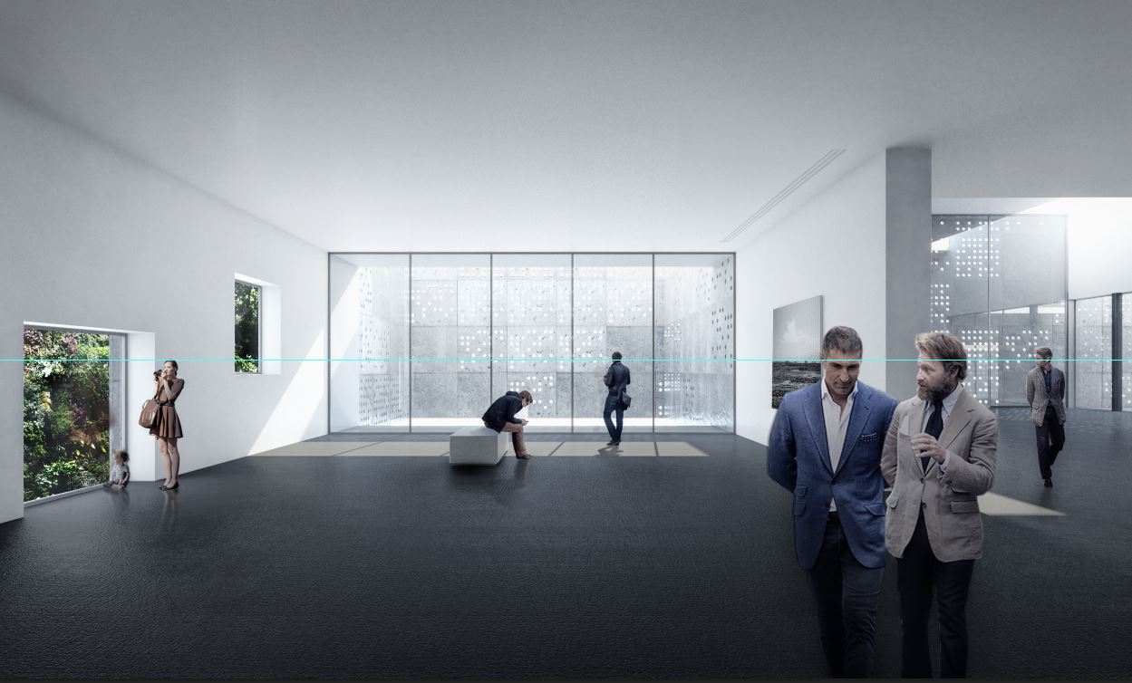
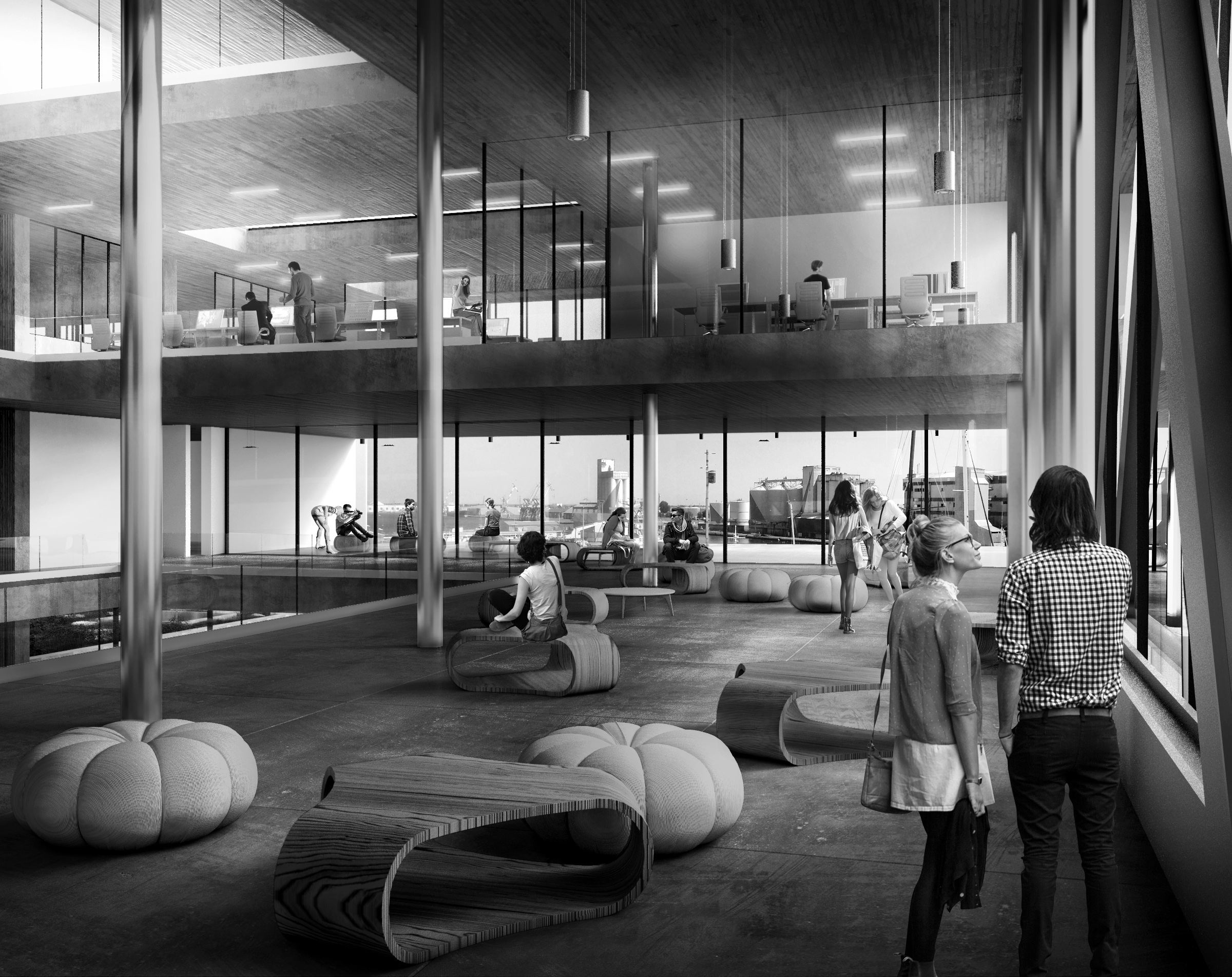
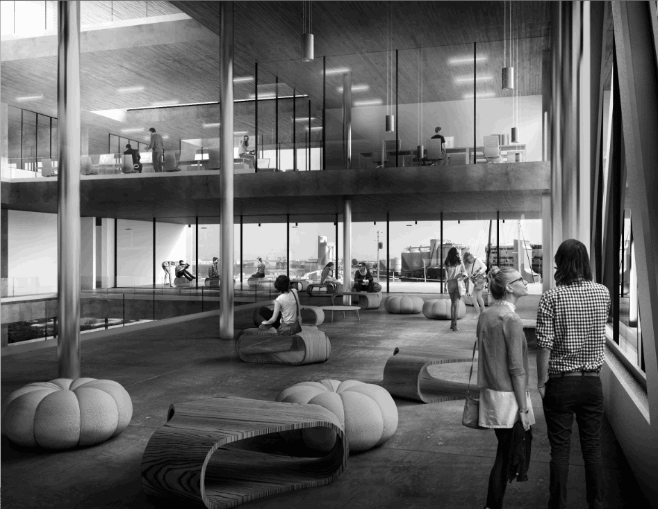
The project is a photography school in the port area of Nantes. It was designed by student Pauline Personeni at the École Nationale Supérieure d'Architecture de Strasbourg.
The project consists of a translucent box cut through by a large atrium connecting all the levels. The ground floor is totally open and runs indifferently indoor and outdoor giving the box a floating impression since it overlaps an adjacent excavated space. Exhibition space and lecture hall are underground, widely open to the excavated exterior public space while administration space and lecture rooms are in the upper levels.
The image here depicts the student hearth as well as the IT room upstairs with the atrium cutting through the space on the left side of the image. Since this tutorial is not about composition, we'll jump straight to what we're after: **populating an image like a pro**.
Here's my step by step workflow.
# Populate your render
The first question is when do you start populating your image? I tend to do it towards the end for one simple reason: you have to focus on the image until the very end. Entourage can become quite a distraction as well as an easy way out to camouflage imperfection in your renders. This is not the way you want to use people in your render.
Typically, I will start worrying about populating my image **when my base render has perfect texture adjustments, lighting adjustments, and near-final cropped area**. Colours don't have to be definitive to start populating your image since you will be inserting people while in black and white mode.
View fullsize
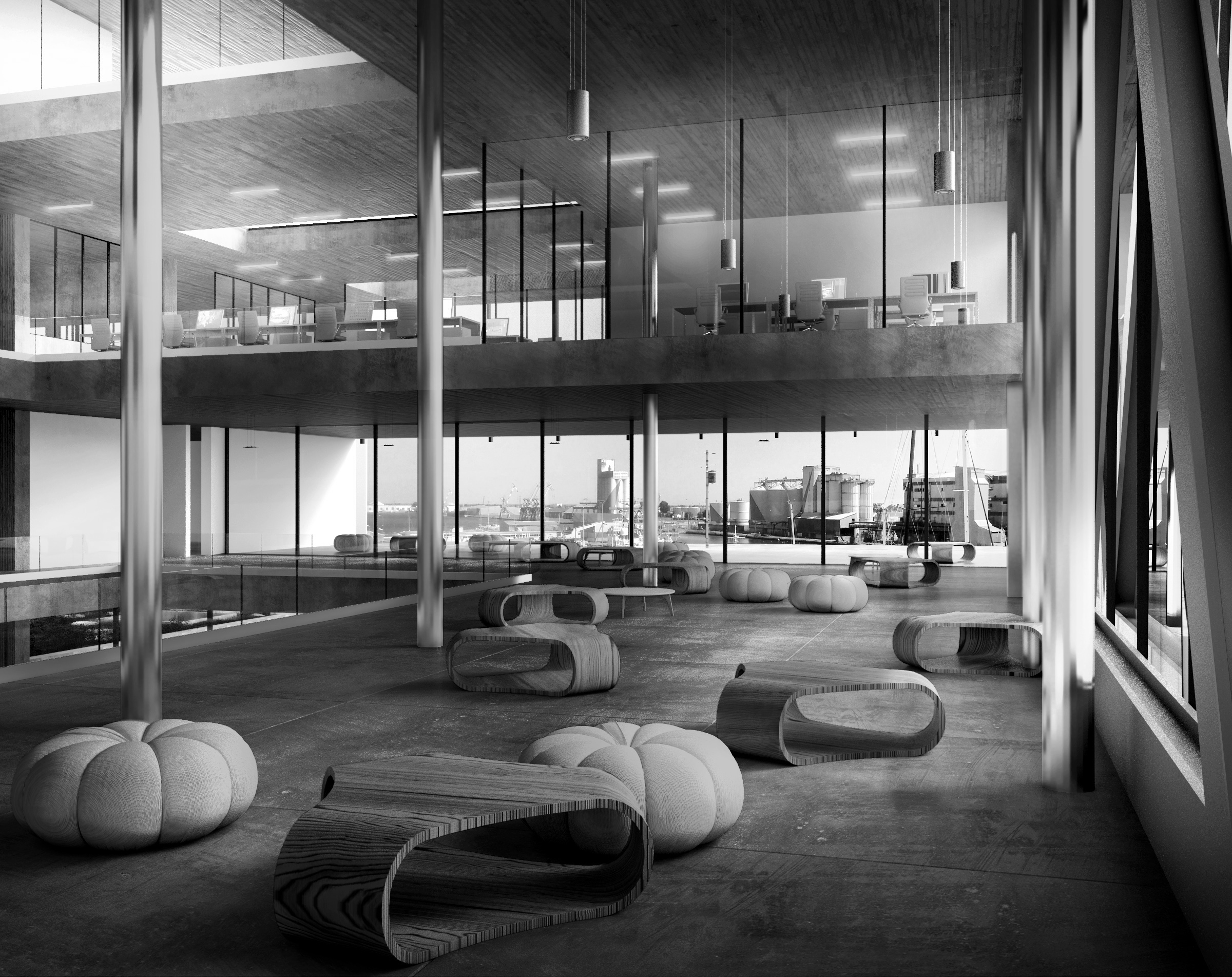
Here is the kind of image you want to have before even thinking about populating your scene.
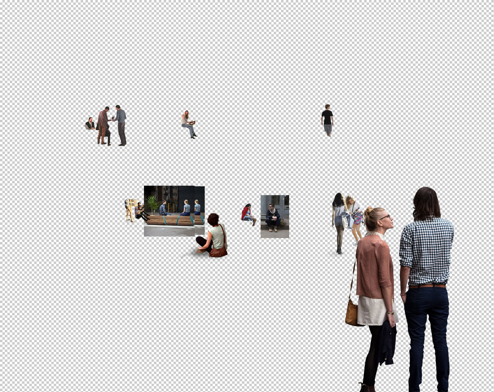
## 1. Choosing the right cutout people
To get an overview of my cutout people library and choose the people I'll insert in my scene, I use **Adobe Bridge CS6**. It is really useful since it shows you thumbnails of any type of image (.jpg, .png and even .psd). Scrolling down your library, you just **Ctrl+click** the cutout people you want and then drag them in Photoshop. There is also a built-in extension called **MiniBridge** available in Photoshop (**Window>Extensions>MiniBridge**) which does the exact same thing as Adobe Bridge without having to leave the Photoshop environment.
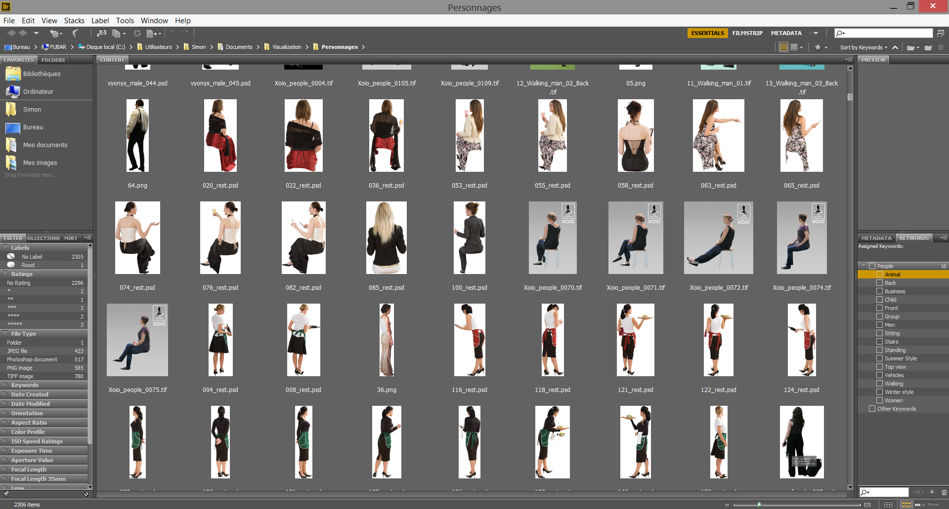
Here's an overview of my people library in Adobe Bridge CS6 displaying thumbnails for .png .jpg .tif or even .psd files, making the browsing much quicker.
When choosing the people you're going to insert in your image, you have to keep in mind a certain **consistency regarding the scene you're working on**.
This is pretty basic, but you don't want to use cutout people in tshirts and shorts in a winter scene, or people with puff jacket on a summer beach scenery. The worst case scenario being putting both in the same rendering. **The amount of detail you manage to take into consideration when choosing your people will have a tremendous effect on the credibility of your image.**
Don't hesitate to **choose many cutout people** for your scene even if in the end you'll only use a couple of them. The more testing you do with the entourage, the more refined your scene will feel.
This is actually why I tend not to tidy my people library too much (except for the "weather" aspect, which can clearly exclude cutouts from a rendering). When you scroll down your library looking for a specific type of people, even though it could be interesting to tag your people so that you only find what you're looking for (standing, walking, sitting, etc.), you can come across a type of character you didn't even have in mind and that would suit well or even better in your scene that what you were looking for.
Yes, it is a little bit more time consuming. But chance can be on your side and make up for this time loss when you find the perfect cutout character for your scene.
Another thing you have to keep in mind is **the perspective of each cutout people**. We'll have a better look at it in the next section, but just don't waste time choosing cutout people with low-angle shot if none of your people are going to be placed above your horizon line in your image for example (for that purpose, you can use tagging).
A little digression here since, when it comes to perspective matter, people are going to argue that 3D people can be the solution. In a nutshell, here's why I think they should rather be avoided:
---
**The bad**
- They're (really) expensive (oftentime, the price of a single phootscanned 3D model will be the same as a one year subscription for 2D cutout people)
- There are not that many 3D people around the internet at the moment, so you end up seeing the same people over and over again in your render (same happens with free 2D cutouts)
- Most of the free models are not that realistic (skin texture is always a bit odd, their facial expressions are quite limited, and their posture or the way they move don't look natural)
- They increase render time and the amount of RAM needed (which can become a problem when you're GPU-rendering)
- Once it's rendered, you have no flexibility to test different populating scenarios
**The good**
- They're always at the right scale
- They're well integrated in their surrounding
- They're great when used in scenes with highly reflective materials (mirrors, glass, etc.)
- Their shadows are perfectly oriented
- Photogrammetry brought a big boost in skin and hair realism
---
Being a freelancer, I cannot afford to pay a higher price for a product that won't suit my need perfectly, as well as not save me a substantial amount of time in post-processing.
Of course that's only my opinion. If you're working in a larger firm, or have 3D people deeply anchored in your workflow, just go on with it. **But you'll see that by using the script I've concocted for you, populating your renders seamlessly with 2D cutout people only becomes a matter of seconds.**
## 2. Placing your cutout people in your render
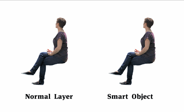
**The flexibility of Smart Objects**
Once you've selected all your potential cutout people, just **drag and drop** them in your .psd file directly from Adobe Bridge (or a normal window if you don't use Adobe Bridge). They will automatically load in your file as smart object.
What is interesting with **smart objects** is that, since they're sort of reference file and not the actual file, **they don't lose definition when you resize them**. This is particularly convenient because when you populate an image, you can try to position one character in different area, resizing it multiple times.
To make your layer a smart object, just right click on the name of the layer and click **Convert to smart object**.
The only drawbacks of working with Smart Objects is that, since they keep more information, they tend to make your Photoshop file a bit slower. If you're 100% sure your cutouts are in place, you can rasterize them.
**Use an efficient folder hierarchy**
When all your cutout people are in the psd file, you might want to organize them a little bit. One simple way of doing it is to **seperate them in** **two groups depending on whether they are in front or behind glass** (typically speaking windows).
The idea then is to have **one group with every people in front of glass**, then a layer with your **reflection pass** (from Vray or whatever render engine you're using, for example, or a composited reflexion layer of your making), and then **a group with every people behind glass**. Either way, there has to be a reflection layer in between these two groups so that you can easily tell that a person is inside a building, or outside.
You can even **color tag your folder** so that it stands out a bit more from the rest of your layers. To do so, just **right click your folder and choose a color in the dropdown list**.
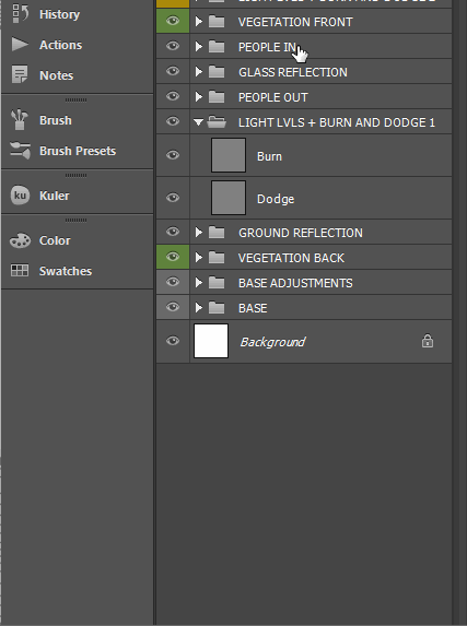
Right click on your folder to get a selection of color tags
**Vanishing point and its application in your render**
All your cutout people are organized in seperate color tagged folders and converted as smart objects. **Using a hue/saturation adjustment layer on top of everything, we turn the whole image in black and white so that we only focus on composition**.
We can now start placing people properly in the image. To do so, we just have to keep in mind some **perspective principles**.
The whole idea of perspective can be summed up in one simple concept: **vanishing point**
In a render you'll typically have one or two vanishing points even though you can have up to many more. In the case of a simple vanishing point, the rule is quite simple: **the horizon line is at eye-level or camera-level**. If an object stands under this horizon line, its vanishing lines angle up to the horizon line. If an object stands over the horizon line, its vanishing lines angle down to the horizon line.
Simply put, that means you cannot see the top of an object if your eye level is under it and vice versa. If your eye level is at 1.6m and you place a person in an upper level, you won't be able to see the top of his head or shoulders. So beware of such inconsistencies in your render.
To make placing people easier, one simple way is to set your camera at eye-level for the render (around 1.6m) and to look parallel to the ground (frontal view). **Having odd camera angle or height will make populating your image much harder so be extra careful that your camera angle or camera level are chosen wisely**. Also keep in mind that from a marketing point of view, you want to show your clients **points of view they will actually encounter in real life**.
If you're in a frontal view, with your camera set to eye level, populating your image becomes extremely easy:
1. **Drag down a guide to mark the horizon line** (Ctrl+R to get your ruler, and then just click your ruler and drag to the canvas. To delete a guid, just drag it back to the ruler above while using the move tool (V))
2. Your horizon line being at eye level, **all the heads of your cutout people standing at the same level than your camera must be more or less around this line**.
3. **Resize them** so that their feet touch the ground at the right place
4. Once some people are well integrated, it becomes easier to insert other people on upper or lower levels, or people sitting for example.
View fullsize
Using a guide, you can check that your cutout people are at the right height if their head is near the horizon line.
With that in mind, you can start populating your image accurately.
Another way to make this process easier is to put some thin cylinders in your 3D model and make them human size (1,6m to 1,9m) and scatter a couple of them in your scene. This way you'll get the right size directly as well as the direction of their shadows.
## 3. Telling a story with entourage
When populating a scene, you have to follow the same rule of composition as you would when choosing your point of view. Here is a little list of things to consider:
- **Be careful not to overpopulate your scene.** There is a fine line between the exact right amount of people in a scene, and too many of them. For example, if you do a scene for a family house, you don't want to put more than two people. Three tops, or you have to have a fair explanation for having 10 people in your living-room. In a more crowded context, you don't want to overpopulate your scene to the extent that you can't even read the space properly. Even though part of what you're selling via your image is the people using the building, you're also selling the building itself.
- **Entourage should not overshadow the architecture** **but enhance it**. On the other hand, underpopulating an image, while potentially creating a really nice atmosphere, can mean different things. For instance, by placing only one person in a big space, you'll be walking a tightrope between a dramatic effect of architectural glory and a malaise. Why is this dude alone in this space? While photographically speaking it can be beautiful, from a marketing point of view, you sometime cannot take the risk of it being misinterpreted.
- **Work with depth**. Populating your scene can help grasping the depth of your image by anchoring each plan. Placing someone in the foreground (while not hiding your image of course) can give a direction to look for the audience. **Creating animation in each layer of the building will help in reading the complexity of the building as well as understanding how it interacts with its direct surrounding**.
- **Create a coherent story**. As an archviz artist, you're asked to foresee what is going to happen in each space. When placing your cutout people, you have to create different types of interactions depending on the space you're working on. Are people rather experiencing the building by themselves, or in group? What would they be doing at this time of the day in this building? Is this scene more about people walking or people standing? If the building is about verticality (say you have a central atrium), it can be interesting to place someone looking upward to suggest this idea. **Creating as many interactions as you can between people/people and people/building is the key.**
- ****Be careful with flipped people.**** Sometimes, a person will fit better in the scene when flipped horizontally. When you do that, just be careful of any text (brand on a tshirt, logo on a car, etc.) that might get flipped as well.
- ****Don't try to draw attention to your people from the unclear parts of the building.**** Populating your image is not about hiding the flaws of your space, but about emphasizing every architecturally interesting aspect of it. Don't rely on entourage as a camouflage for bad architecture work.
What you must pay attention to is the overall coherence throughout the whole image. **Don't forget to zoom out of your image from time to time to get a better overview of the scene.** It doesn't really matter if the scaling is a tiny bit off from one person to another, **what does matter is that the audience can feel the interactions when they look at your image**. When people are close to each other, make them face each other and talk to each other, make them point at stuff, make them use the furniture, etc.
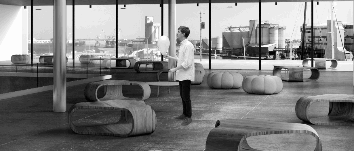
View fullsize
Here is my People group of layers, not masked yet.
## 4. Masking people to blend them in their surrounding
Your people are now in place, but there's still a long way to go before they blend perfectly in their surroundings.
The first thing is to erase parts of them that should not be seen because it is hidden by an object. To do so, **don't use the eraser tool**. In the same way that we used smart object so that we can resize our cutouts until they're in the perfect spot, we don't want to make a sloppy erase work and have to redo it all over again. To erase something in a non-destructive way, we use a **vector mask** which, as the name suggests, **masks** your layer.
To create a vector mask, simply click on the layer you want to mask, and then click on **add a vector mask**. Vector mask are pretty straightforward: instead of using an eraser, you'll paint black or white over the vector mask. **Painting black will hide the layer, painting white will reveal it.** Using this technique, select each cutout layer and hide parts that need to be hidden.
Your people are now in place, but there's still a long way to go before they blend perfectly in their surroundings.
The first thing is to erase parts of them that should not be seen because it is hidden by an object. To do so, **don't use the eraser tool**. In the same way that we used smart object so that we can resize our cutouts until they're in the perfect spot, we don't want to make a sloppy erase work and have to redo it all over again. To erase something in a non-destructive way, we use **vector mask** which, as their name suggest, **masks** your layer.
To create a vector mask, simply click on the layer you want to mask, and then click on **add a vector mask**. Vector mask are pretty straightforward: instead of using an eraser, you'll paint black or white over the vector mask. **Painting black will hide the layer, painting white will reveal it.** Using this technique, select each cutout layer and hide parts that need to be hidden.
View fullsize
Using the brush tool, painting black in the vector mask hides the layer while painting white reveals it back.
To make your people blend in properly behind objects, either **use a soft brush on your vector mask or feather the edge** of your selection because the edge between the person and the object cannot be perfectly crisp.
This feather edge technique can also be used when you're cutting people out of photograph yourself. After doing your selection (with the magic wand, the pen tool, or any other selection method), instead of hiding the unwanted part, click first on **refine edge** in the upper tool bar (when using the marquee tool (M)). In the pop up window shift your edge inside by 30 to 50% approximately, and add a little bit of feather 0,5 to 2px depending on the size. Click OK. Now you can paint black the parts you wanted to hide. The little feather you've just added will add a bit of realism and believability to the insertion of your newly cutout person.
View fullsize
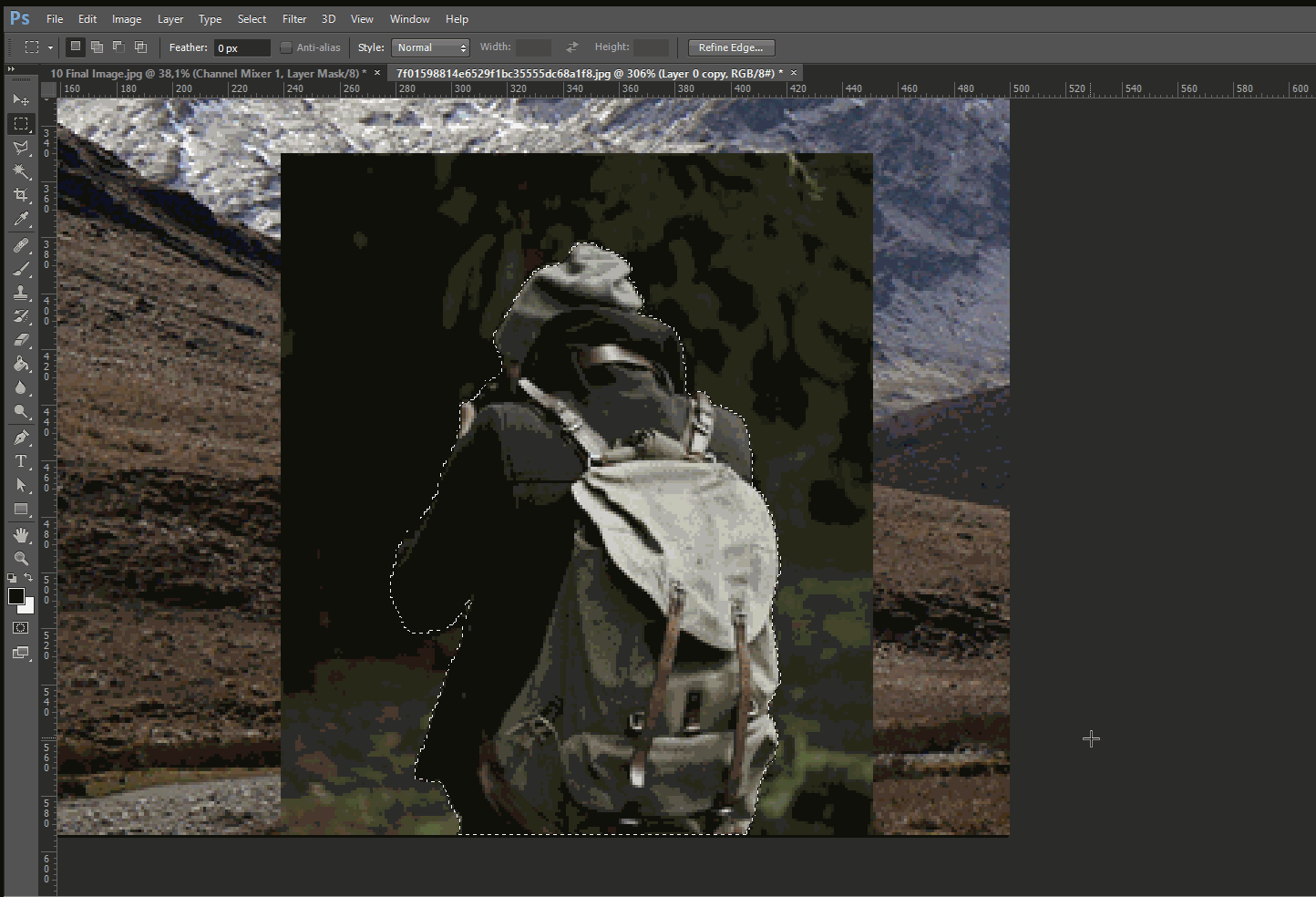
Once the selection is done, click on refine edge. After you've adjusted the feather and edge shift, click on add a vector mask to mask the unwanted part of the image
View fullsize
People are hidden properly behind objects (chairs, columns, etc.) using a vector mask for each person.
## 5. Adjusting light and shadow
The next step in our quest to populating our scene seamlessly is to work on light and shadows.
**A bit of theory**
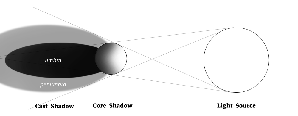
For each object in space, sunlight will create different areas:
- **The light side** directly hit by the light, with highlight and halftones.
- **The shadow side or core shadow** which is not hit directly by sunlight, with darker tones.
- **The reflected light** which happen when the light is reflected on the object from the surface it sits on (the shinier the ground, the more visible this effect will be).
- **The cast shadow** which is divided in two areas **umbra** and **penumbra**
Here's a simple workflow to create each of these components
### Core shadow and highlight
To create the transition between the bright and the dark side, we'll simply duplicate the cutout, and add a **black** **color overlay layer style**. To do so:
1. Select the layer with your cutout
2. Ctrl+J to duplicate
3. Click the **fx** button and add a **color overlay** layer style
4. Choose a black color (or really dark grey)
5. Add a vector mask
6. Paint the vector mask black in areas that must be bright according to the way your scene is lit, and paint white for the darker areas.
7. Also, keeping in mind the **reflected light phenomenon:** if your ground material is highly reflective, paint black the area of the mask where your person sits so that you bring some light in the contact area.
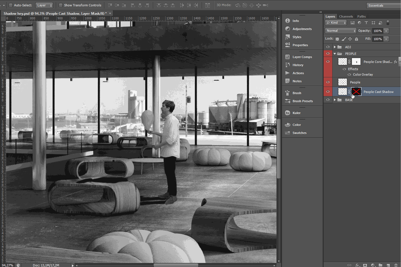
### Cast shadow
To create the cast shadow and suggest the differentiation between the **penumbra** and the **umbra** zones (this gets a bit tricky here):
1. Select the layer with your cutout on it
2. Ctrl+J to duplicate (or **Alt+Click and drag** down or up)
3. Click the **fx** button and add a **color overlay** layer style (TIP: if you've already created such an effect, you can simply **Alt+Click and drag** the **fx** on the layer to another layer to apply the exact same effect)
4. Select the new layer, **Ctrl+T** to transform
5. Right click and select **Distort**
6. Using the centre handle in the upper part of the transformation rectangle, drag the shape so that it's oriented correctly against the sun
7. **Filter>Blur>Gaussian blur** to add a little bit of blur on the edge
8. To differentiate the **penumbra** from the **umbra,** we'll start by **adding a vector mask**
9. ****Ctrl+click**** on the layer thumbnail to select its content
10. While **using the **marquee tool (M)**, click on **refine edge****
11. ****Shift the edge inside and add a bit of feather****
12. ******Ctrl+shift+I****** to invert selection
13. Fill selection with a medium grey (****Alt+Delete****)
14. ****Change opacity**** until it fits in the rest of the image
15. If it is not already the case, **place this layer under the base cutout layer**
An additional small detail that you can add is a small feathered circle/ellipse that sits right under the feet, or any part of the body in contact with an object. To achieve this effect, do the following :
1. Draw a simple circle with the marquee tool
2. Fill it with black using a layer style (fx at the bottom of the layer panel), although we'll see further in the article how to get the proper hue for shadows.
3. Blur it a little
4. Distort the circle in order to get a quite flattened ellipse
5. Duplicate the layer under every foot of your cutout
6. Merge all the created layers
With these simple steps you'll add an extra dose of realism to your integration.
## 6. Creating ground reflection
Contrary to the previous step, this one is pretty straightforward. In real life, most surfaces reflect what is sitting on them. Only their level of reflection and the glossiness will change, sometimes making the reflection ever so subtle that we end up skipping it.
To create a ground reflection:
1. Select the base cutout person layer
2. **Ctrl+J to duplicate** or **Alt+Click and drag down**
3. ****Ctrl+T** to transform**
4. **In the **Reference Point Location**** (upper left hand corner, under file/edit/image/etc.) ****click the lower handle in the middle**.**
5. ******Right click** on the image and click **Flip Vertical******
6. ********Adjust the height** if the reflection is not properly in contact with the base layer******
7. ********Filter>Blur>Gaussian blur******** the amount will depend on the glossiness of the ground material. The shinier the ground is, the less blurry the reflection will be, and vice versa.
8. **Create a Hue/Saturation adjustment layer** on the reflection
9. **Ctrl+Alt+G** to clip the layer to the reflection layer
10. Desaturate the reflection a little, and lower the brightness **because a ground reflection will always be darker than what it is reflecting**.

## 7. Adjusting colours
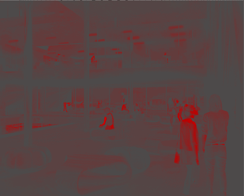
Our people are now starting to blend in pretty well in our scene. Core shadows, cast shadows and even ground reflection. Pretty cool. But when we turn off our hue/saturation layer and get the image back to color mode, we can notice that some of our colors are a bit off. This is mostly because of **saturation**.
An image can be divided in three values: **Hue**, **Saturation** and **Brightness** (or Luminosity). We've seen in the [**previous tutorials** **that we can isolate Hue by neutralizing Luminosity**](http://www.horoma.net/tutorials/2015/making-of-photography-school).
To do so we filled a layer with pure red (R:255 G:0 B:0) and set its blending mode to **luminosity**. In order to isolate saturation, we have to neutralize hue as well. To neutralize hue, we have to fill another layer with pure red (R:255 G:0 B:0) and set its blending mode to **Hue**.
**Hue and Luminosity** being neutralized when we turn both of these layers on, **the only information left is the saturation**. To bring it up a bit more, we can use a hue/saturation adjustment layer and increase the saturation so that the discrepancy between different levels of saturation are emphasized.
The idea behind all this is that, in real life, saturation levels are homogeneous. Using this technique we can put our finger on inconsistent saturation levels. To correct them, we simply use a hue/saturation adjustment layer, clip it to the affected person (**Ctrl+Alt+G**), and lower or increase the saturation until the person blends perfectly in its surroundings. Repeat for each cutout person.
The final step regarding the colours is to get your shadow colours to fit with the shadows of your rendering. To do so, just use the filters described in this video : http://www.horoma.net/tutorials/the-fundamentals-of-hue-saturation-and-value
The idea is to identify the hue of the shadows (they are usually blue or purple) and to change the fill color of your shadows to match this hue. You should then get your shadows to blend nicely with the rendered shadows.
## 8. Adjusting definition
I wrote earlier that one impotant thing is to place your cutout on different planes so that you show the depth of your project. This leads to a point we need to tackle which is the definition of your cutout.
In a regular rendering, or photograph, the sharpness of objects will decrease as they get further. This means that if you integrate a cutout far from the camera, its definition should decrease as well.
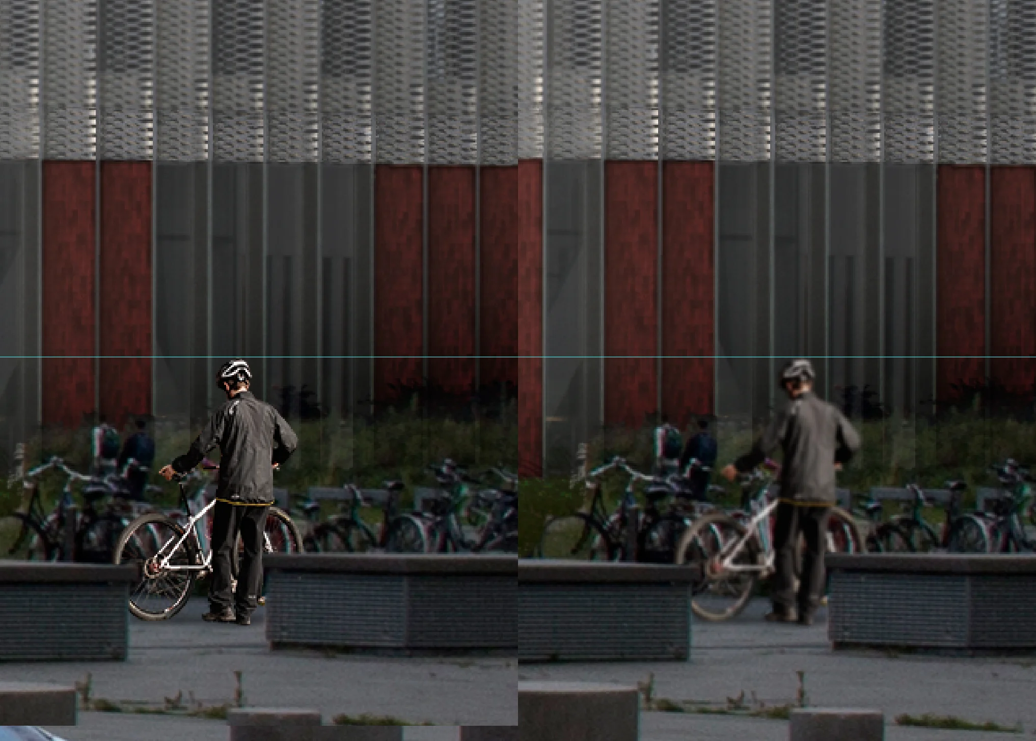
On the left, a resized cutout. On the righ, a resized and blur cutout to better fit the context
As you can see on the image above, which is a crop of a 4K image, the definition of the surrounding of the cutout is quite low, making the cutout stand out particularly due to the sharpness of its edges.
To better blend it in its surrouding, **add a slight gaussian blur** in order to match the feathering of the direct context. **Losing the extra detail of the cutout will help in blending it properly in the image**.
Keep in mind that this rule not only apply on cutouts, but on your project in general. If you insert your rendering in an existing photograph, you have to not only match hue, saturation and value, but also, oftentime, had a slight blur to fit the definition of the image you're using as a base.
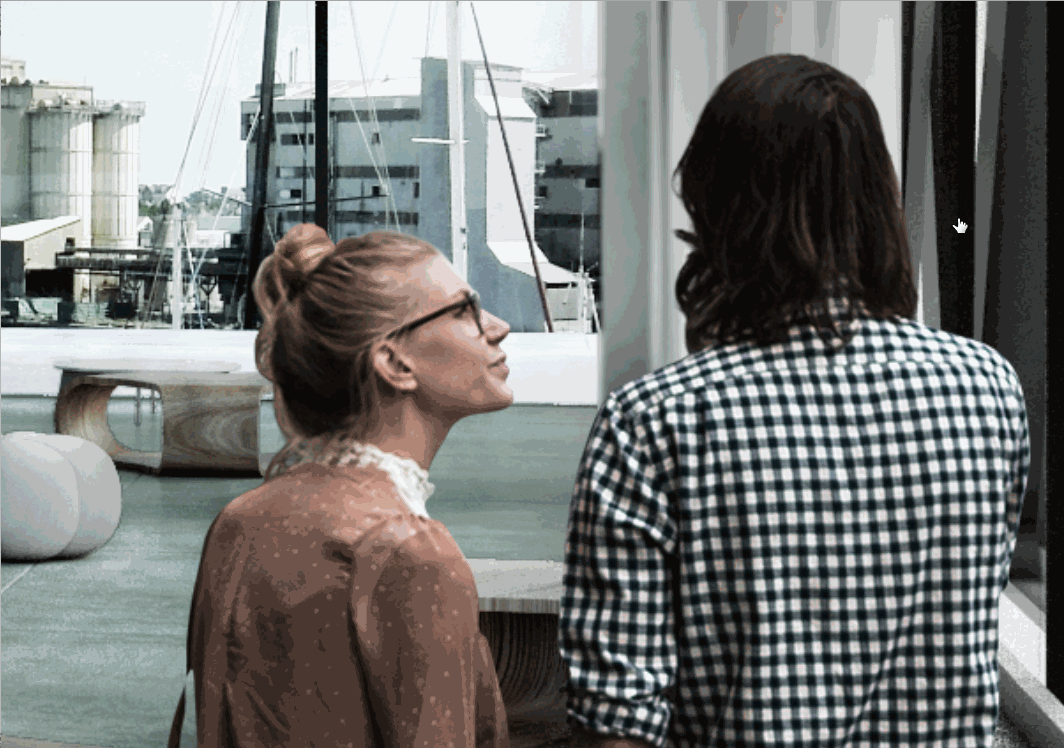
## 9. Going the extra step: the rim effect
Having taken care of the lighting, the drop shadows, the saturation, the people are now perfectly blending in their surroundings. We could stop there, but there is one last step for the perfectionist.
One physical phenomenon happening all the time around us is the fact that the surrounding light sort of wraps around any object in space. In our context, we could simplify by saying that the **background wraps around the edge of our cutout people**. This effect is quite easily transposable into photoshop and adds this extra dose of realism to make your people seamlessly blend in their surroundings.
1. Duplicate the final image without the people by selecting the first layer below your People Group, and press **Ctrl+Shift+Alt+E**
2. **Move the layer** on top of the person you're trying to blend in the background
3. **Ctrl+Alt+G** to clip the layer to the layer below
4. **Ctrl+Click** on the thumbnail of the base cutout person to select it's edge
5. **Select the new background copy you just clipped**
6. ****Using the marquee tool (M)**,** click on refine edge
7. Shift the edge slightly in, and add a bit of feather
8. **Ctrl+shift+I** to invert selection
9. **Add a vector mask** that will automatically hide the selection, leaving the background only visible on the edge of the cutout person.
This effect has to be extremely subtle, but it will give this extra push towards realism, that we are all aiming for when integrating people in our scenes.
Here is a recap video of all the steps with more details if you ever got lost in the never-ending bullet lists.
## 10. Saving time with a photoshop script
<iframe width="560" height="315" src="https://www.youtube.com/embed/e74pbn77USQ" title="YouTube video player" frameborder="0" allow="accelerometer; autoplay; clipboard-write; encrypted-media; gyroscope; picture-in-picture; web-share" allowfullscreen></iframe>
Finally, we're done! As you can see from what we've covered in this tutorial, integrating your cutout people seamlessly in your image calls to quite a bit of knowledge in perspective theory as well as light and shadow physics and imply quite many steps in the process. But these steps cannot be overlooked if you want your work to stand out from the crowd.
Doing all these steps for two or three people is fine, but doing them over and over again for 40 or 50 people will become quite time consuming and demoralising. Fortunately, **I've concocted for you a little photoshop script freebie** **that will reduce all the steps to a few seconds**, increasing your productivity by heaps!
The script is compatible for up to Photoshop CC 2017 versio. Just click **[here](https://gumroad.com/l/vMcB) to grab it**. Don't forget to comment, share and subscribe to our newsletter for more tutorials like this!
**After playing around with the script, you might also be interested in the premium version that comes with other handy features**
[Get The Essentials Photoshop Actions for Archviz Artists](https://gum.co/HrWsh)