**Tags:** #article #process #photoshop [[Diamond 6 - Color]] [[Diamond 9 - Process]] #workflow #business
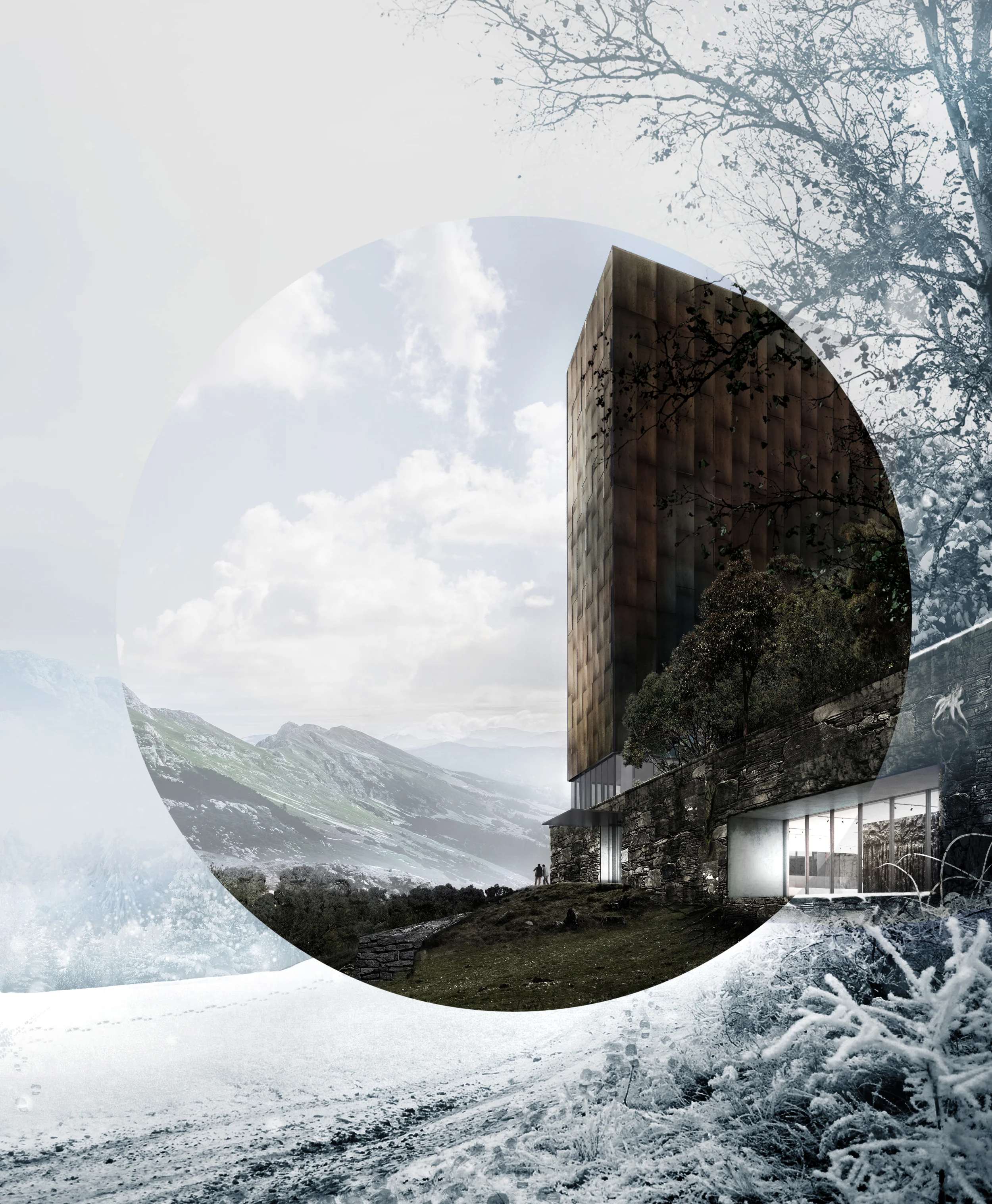
Today we're going to deal with a recurring topic in architecture visualization: adding snow.
Even though you can do wonders in 3ds max (or whatever renderer you're using) to model and render snow, the more interesting thing here is to use the same base for both a summertime render and a winter time render.
Here I used my previous render as it is and tweaked it to build my winter version. As we'll see, there's more to it than just desaturating your image and drawing white dots everywhere.
<iframe width="560" height="315" src="https://www.youtube.com/embed/M291XZGcOj4" title="YouTube video player" frameborder="0" allow="accelerometer; autoplay; clipboard-write; encrypted-media; gyroscope; picture-in-picture; web-share" allowfullscreen></iframe>
# The project
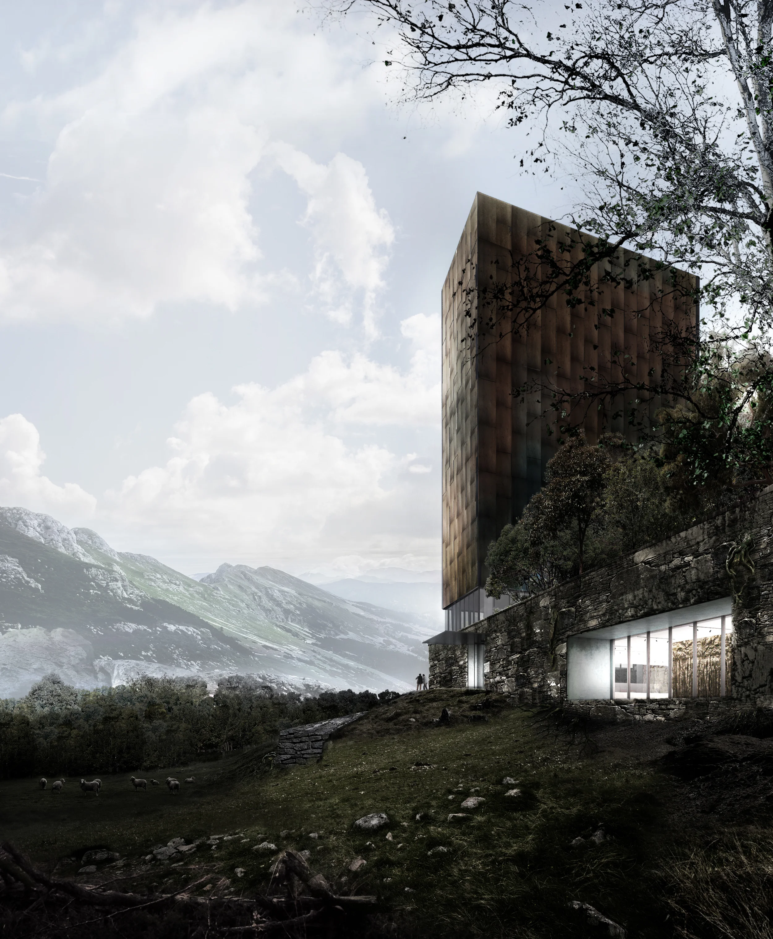
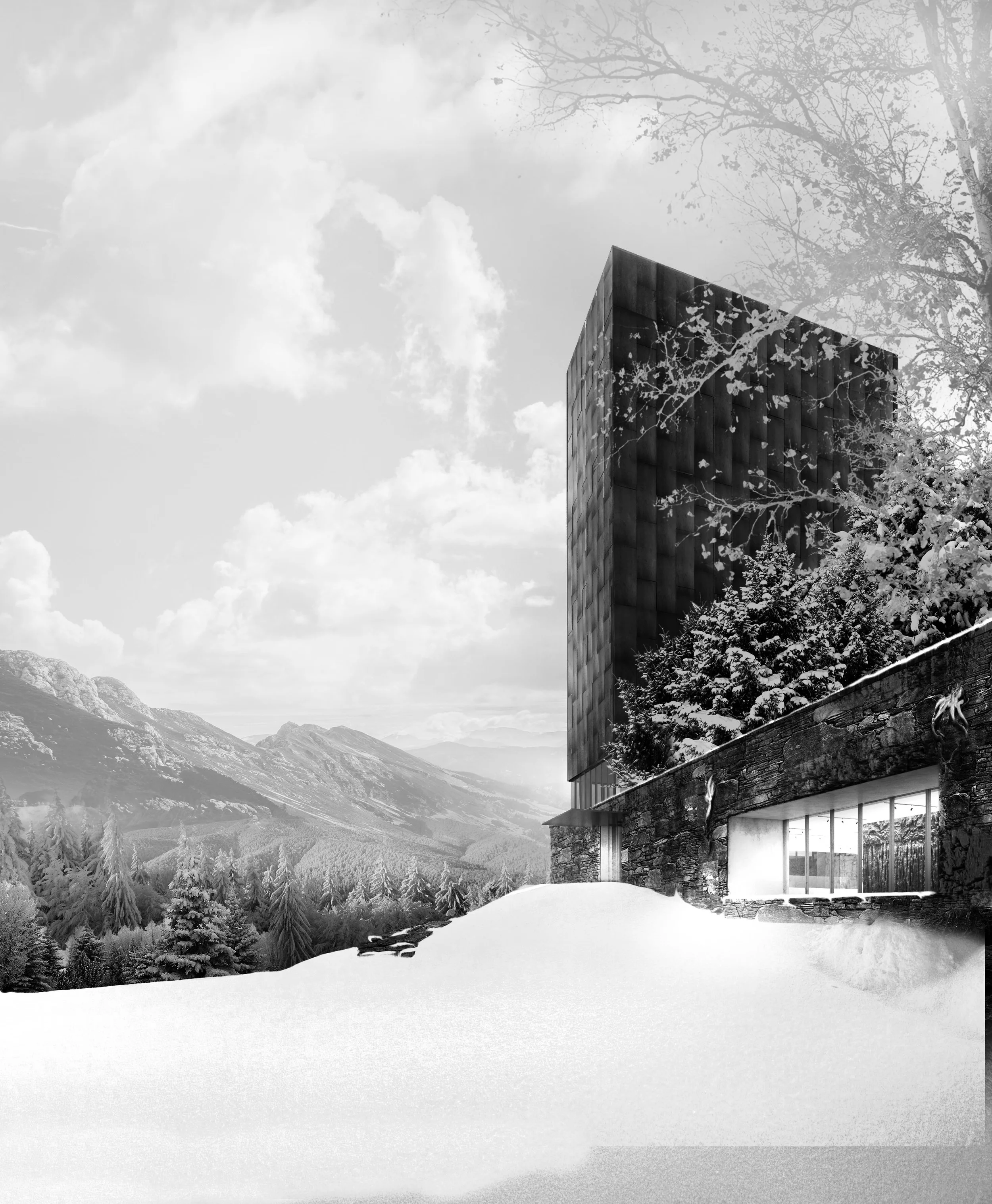
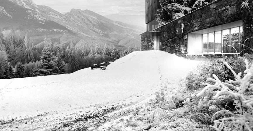
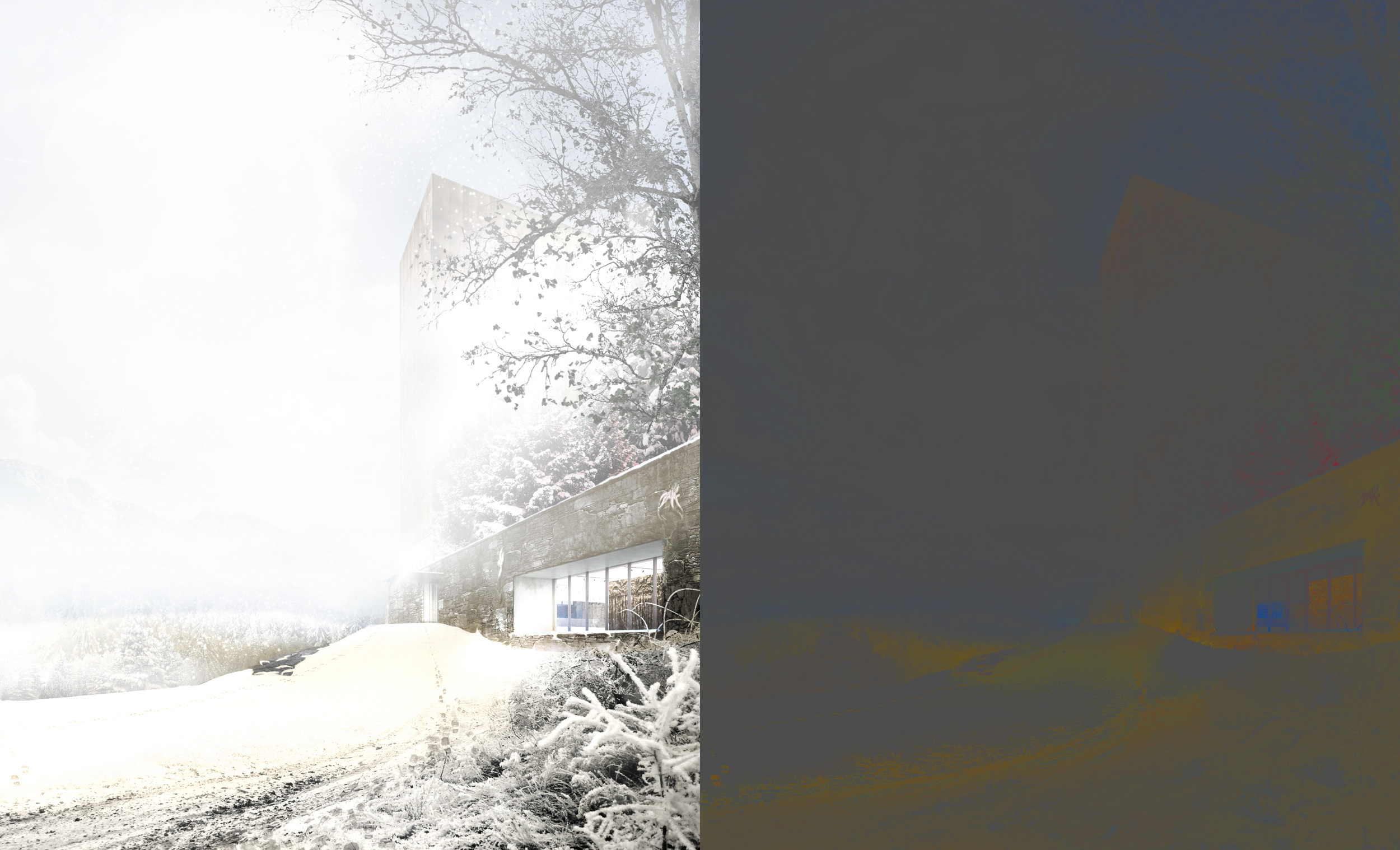
This is the summer version of the project, which is the image we'll start from for our winter version
This is an exterior view of the Draped Art project you might have seen in an earlier post (and if not, [there it is](http://www.horoma.net/tutorials/2015/making-of-draped-art) ).
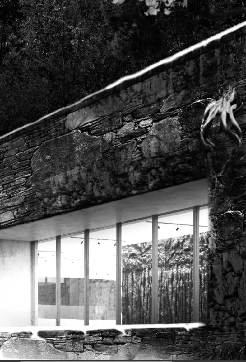
The project consists in a slender copper-cladded tower emerging from a stone podium. The site is quite wooded, and offers amazing scenic views on the surrounding landscape.
In this view we'll see that instead of framing directly on the project, we use the vertical volumetry of the project to frame the surrounding landscape emphasizing the contrast between the strong vertical landmark and the smooth natural horizon.
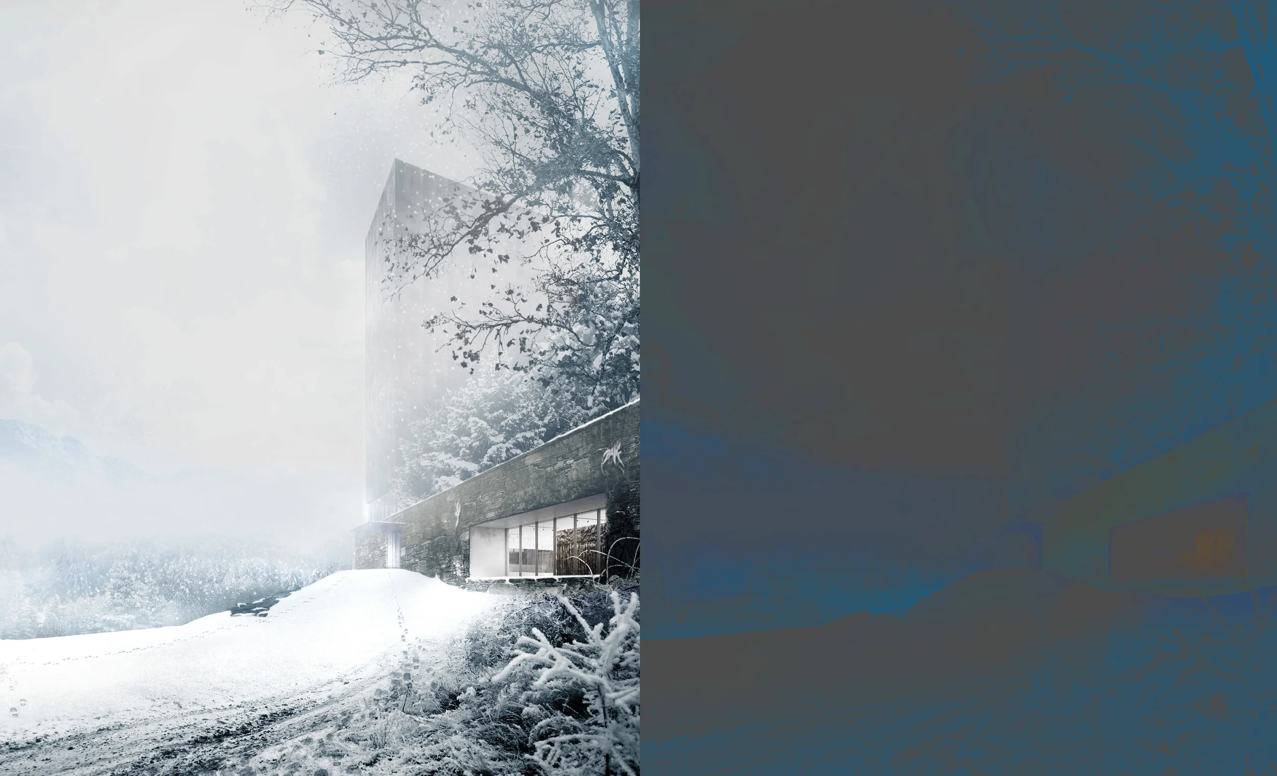
# Winter is coming
## 1. Cover the ground with snow
By compositing several snow ground images, you can add a first coat of snow on your ground to use as a base
First things first: turn your image into black and white mode by adding a hue/saturation adjustment layer. Working in black and white will help you focus only on composition and brightness.
If you're used to compositing image you must have a pretty good textures and image library by now. If you don't, just grab some images of ground covered in snow on the internet (on Google, you can add filter such as minimum size as well as usage rights).

Once you have your images (just plain white snow, no need for topography or any extra details yet), just stitch them properly, double check the perspective (either use a photo directly, or if you use a texture use the perspective transformation from Photoshop to give it a sense of depth, depending of your image).
Using vector masks, we can shape our snow so that it follows our topography. Just use the polygonal lasso tool, no need to be that accurate.
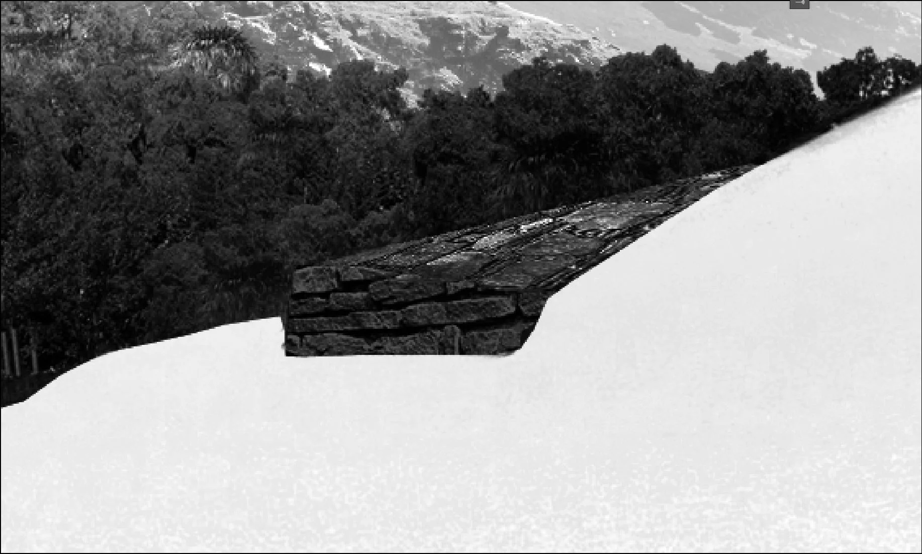
Here is a detail of the low wall with snow around it.
Once the snow area is roughly drawn, we can switch to the **smudge tool** (just hold left click on the blur tool in the tool palette to access it).
The smudge tool will help us achieve the smoother look we're looking for. **Be careful to use the tool on your vector mask** and not directly onto your texture or image. To use it, simply click drag from the inside of the area (the snow) to the outside of the area.
What effect are we trying to achieve here?
Basically the smudge tool will help us creating irregularities. In the case of the stone wall below, we can drag the snow from the exterior of the wall in between the stones to make it look more real.
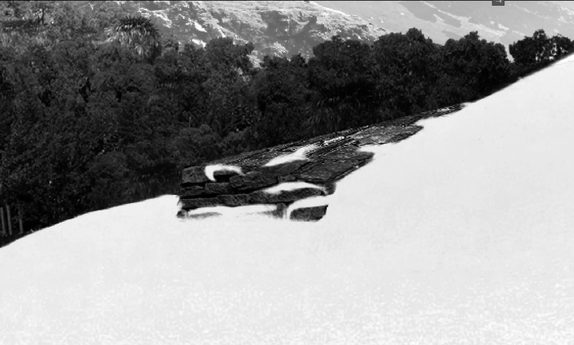
Here is the same detail after using the smudge tool
Don't forget to also add snow on every cornice you might have in your project (see below).
**One little useful trick** : when you want to draw a simple line (just like we could need on this very cornice below), just click at the beginning of the cornice, hold shift and click at the end of the cornice. **It will automatically draw a straight line between the two points**.
Be careful to use a hard brush (say 90% hardness) when you draw this kind of detail. We don't want the edges of the snow to be too feathered.
Once your line is drawn, you can use the smudge tool again to create unevenness.
## 2. Change the trees
Next step, we simply change the trees for more winter feeling ones.
Now that the ground is looking a bit better, we can take care of trees. The principle here is pretty straightforward. We just look for trees covered in snow on the internet (or in your library), and replace the original trees.
Trees on the left are two simple images on two different planes, whereas the bosque on the right is made of individual trees.
Depending on your base image you can either paste them and use a vector mask to erase the unneeded part, or if you're still using your base PSD, you can just switch the trees you're using.
Depending on the level of realism you're looking for, you might want to find the exact same trees (in terms of essence) you had in the former render. Thing is, we're going to add quite a bit of fog and extra details later on in this image which will basically mean : it doesn't matter that much.
**Just be careful of one simple fact** : in winter, deciduous trees don't have leaves anymore. So don't try to desaturate them, to cover them with snow or to whiten them. Either change the actual tree for one that has leaves in winter, or for a leave-less tree.
## 3. Create depth with the foreground
Our snow is looking a bit plain, so we'll start adding a bit more details in it to make it look more natural and interesting.
The bottom of the image that just changed is from a single image I added and precisely cut out using a vector mask. It adds two things that change the whole feel of the image:
- Just like I added rocks, pebbles and a branch from a dead tree on my summer version, adding frozen bushes and a bit of mud in the foreground creates depth in the image. It also leads the eyes on the left of the image, which stays wide open.
- It creates a much more natural looking snow by adding details in it. A simple plain snow can be quite boring and is actually quite rare especially in area where there are supposed to be many visitors, such as a museum.
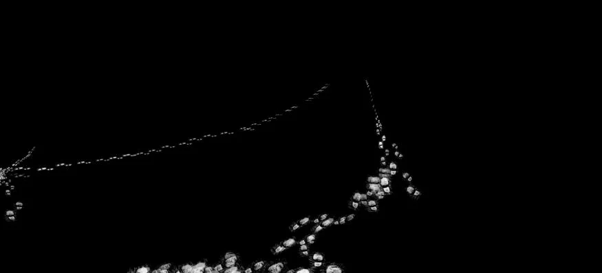
## 4. Add an extra layer of detail with footprints
Here is the fun part of detailing snow : **creating footprints**. Trying to find the perfect image of footprints to blend it in your image can be quite cumbersome, so I tried another way here which ended up being quite efficient in my opinion : **create a custom brush**.
Creating a custom brush in Photoshop is almost as easy as saying it, and the brush presets are so advanced that you can tweak it to do almost exactly what you want it to do.
A couple of words about how brushes work in Photoshop.
To create a brush, you just have to create a new document (not too big, say 500px by 500px) and draw (or import) what you want to become a brush in it. Just be careful to set it to a black and white mode. Something you want to be aware of as well is to create feathered edges so that your brush doesn't stop sharply on the edges.
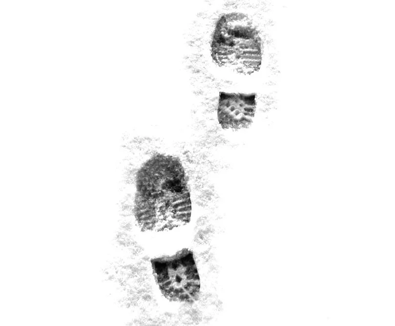
Here is the tweaked image I used for my brush. Don't bother copying it to create a brush yourself, the brush is given for free at the end of the article ;)
As you can see on the image above, the edges are a bit faded out so that it will be more easily integrated in the image.
To create a brush from an image simply merge all your layers into a single layer (**ctrl+alt+shift+E**) and then go to : **Edit>Define Brush Preset>Name your brush**. Once done, it automatically appears at the end of your brush palette.
As said earlier, the interesting part of the brush presets is that you can tweak it quite a lot. With your new footprint brush selected, go to **window>brush**.
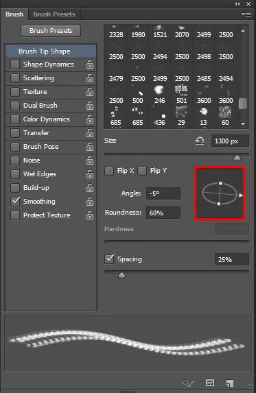
The Brush panel offers quite a lot of possibilities to tweak your brush. In our case we won't need much, but we'll see later on how powerful it can be.
In the red rectangle above is a little circle than enables us to deform our brush shape. This is particularly interesting in our case since our footprint will mostly never be seen directly from above. Therefore, by playing around with this circle and flip Y or X, we can orient our footprints the way we want, and simulate a vanishing point (even though this is normal deformation and not real perspective deformation, but at this scale, it doesn't matter that much).
Oddly, you can only deform your brush in one axis, which means to make all the possible variations, you need two version of your brush : a vertical one and a horizontal one. You just have to switch between the two depending on what effect you're trying to achieve. No big deal.
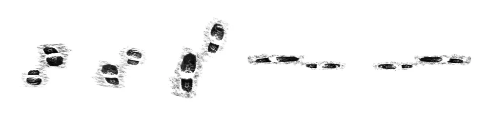
Here are some variations amongst many others that you can achieve using the brush panel
We have our brush and we can basically paint anything we want with it, but using it as is and paint black on snow won't achieve a really good look. To make it look much better, we're going to use it a little bit differently.
What I mean by that is that we're going to group our snow ground layers, and apply a level adjustment layer to it. Concretely, steps are as follow :
1. Select all the layers you used to created your blanket of snow
2. **Ctrl+G** to group them
3. Create a level adjustment layer
4. Put it on top of your group
5. Select it
6. Clip it to the group below by pressing **Ctrl+Alt+G**
Now, just tweak the level of the adjustment layer to make it a bit darker (you'll adjust it properly later on, we just need to see the effect). Nothing should change, but that's normal since the vector mask is pitch black.
Select the layer mask, and start painting white with our footprint brush. Footprints should start to appear. Tweak the levels so that it blends properly in the snow.
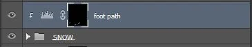
This is what my vector mask looks like
And this is what it looks like on the image
Once your levels are ajdusted properly, you should have pretty good looking footprints in your snow.
## 5. Create depth with fog
Fog! Still need a bit of tweaking level-wise, but the idea is there
Creating fog is pretty straightforward. Create a new layer, fill it with white, then add a vector mask so that you can paint black to make the fog less dense, or paint white to make it thicker.
I usually paint it from scratch, but one thing you can do is use your Z depth layer (from your renderer), invert it, and use it as a vector mask for your fog. To do so :
1. Select your Zdepth layer
2. Ctrl+A to select all
3. Ctrl+C to copy it in your clipboard
4. Alt+Click on the vector mask you created for your fog
5. Ctrl+V to paste your Zdepth image straight into the fog vector mask
6. Ctrl+I to invert it
7. Alt+Click again on the vector mask to leave the view
You can only use this method to have a base for your fog, but either way you'll have to add a bit of yourself in the image. The idea here is to be realistic and artistic at the same time.
Realistic :
- fog accumulates in mid height
- the further the object, the denser the fog will get
- fog is not perfectly homogeneous
Artistic :
- don't hide your building in the fog
- use fog to emphasize specific areas of your project and create an interesting setting
- use fog to differentiate levels of depth in your image
## 6. Add falling snow
The image is starting to get there, but what would a winter scene be without at least a little bit of snow?
This is where we'll get full advantage of the brush settings I was speaking earlier. I borrowed this technique from a [Phlearn tutorial](http://www.phlearn.com/). Here's how to proceed.
### Create a custom brush
Simple step here, we'll create a custom brush for our snow. It will be super simple but will make the difference in the long run. As explained earlier, all we need is to create a new document and draw a black and white shape and then set it as a custom brush.
Above is the shape you want to draw (on a 500 by 500 pixels document). Pretty simple heh!
The thing is by doing this simple brush we create two parameters :
- The spacing between two snowflakes
- A minimum and a maximum (relative) size for the snowlakes
When done : **Edit>Define Brush Preset>Give it a name**
### **Adjust the presets for our new brush**
In the brush settings (**Window>Brush**), we'll have a closer look at several parameters:

Here are the four categories we'll be interested in to create our custom falling snow effect
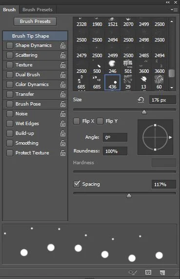
First category, the **Brush Tip Shape**. By playing around with the spacing slider, we can set the distance between our snowflakes.
You can see the realtime preview at the bottom of the window.
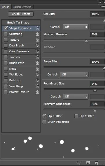
Second category, the **Shape Dynamics**.
- Increase **size jitter** to 100% will create a randomness in the size of the snowflakes, which is pretty handy since snowflakes never have the same size
- **Minimum diameter** will set the minimum size of our snowlakes
- **Angle jitter** will create randomness in the angle at which the brush is used. Pretty handy as well to create chaos in our falling snow. You can set it to a 100%
- **Roundness jitter** will deform a little our snowflakes. Keep it near 100%
In the preview, you can now see that our snow is looking much more chaotic, hence realistic and believable.
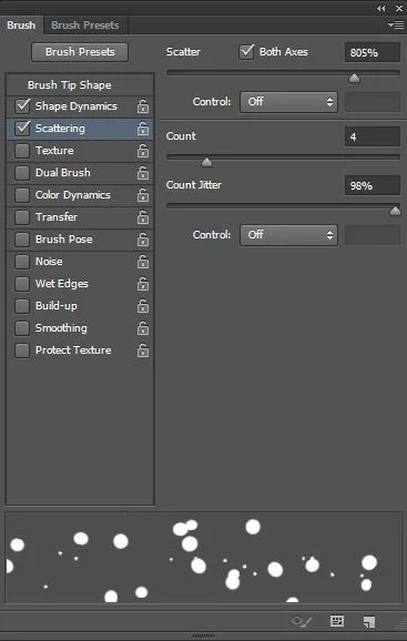
Third category, **Scattering**.
It pretty self-explanatory. Just play around with the three sliders until you get what you want. You don't want your snowflakes to be too dense though. Keep in mind that it can still be adjusted on the fly if you're not satisfied with your first parameters.
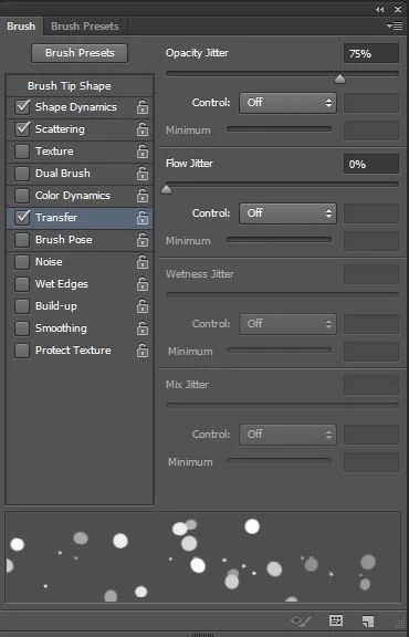
Last but not least, **Transfer**.
This one will create randomness in terms of opacity in your snowflakes. Extremely useful as well so don't overlook that parameter.
### Paint snow
Now that our brush is neatly set, we can start painting. The workflow here is pretty simple.
- Create a new layer and with a small brush paint in the background in a quite dense way.
- Create a new layer and with a bigger brush paint in the middleground in a more sparse way.
- Create a new layer and with a larger brush again paint your foreground.
- You can even create a final layer and paint with a really large brush with only a couple of strokes to simulate snowflakes landing on your camera lens for example.
### Gaussian blur and motion blur
Our snowflakes still look a bit too sharp and unreal. But we're only one step away from believability.
For your background to middleground layer, select your layer one by one and add a gaussian blur (**Filter>Blur>Gaussian Blur**). The number of pixels for your effect depends on several factor. The only thing you have to keep in mind is : **what is in focus?**
If your snowflakes are in focus blur them just a little to get feathered edges. If they are out of focus, blur them even more but not too much so that we can still capture the shape of each snowflakes.
For your foreground, first apply a motion blur (**Filter>Blur>Motion Blur**) to create a sense of motion. And then apply a gaussian blur (**Filter>Blur>Gaussian Blur**) to get rid of sharp edges.
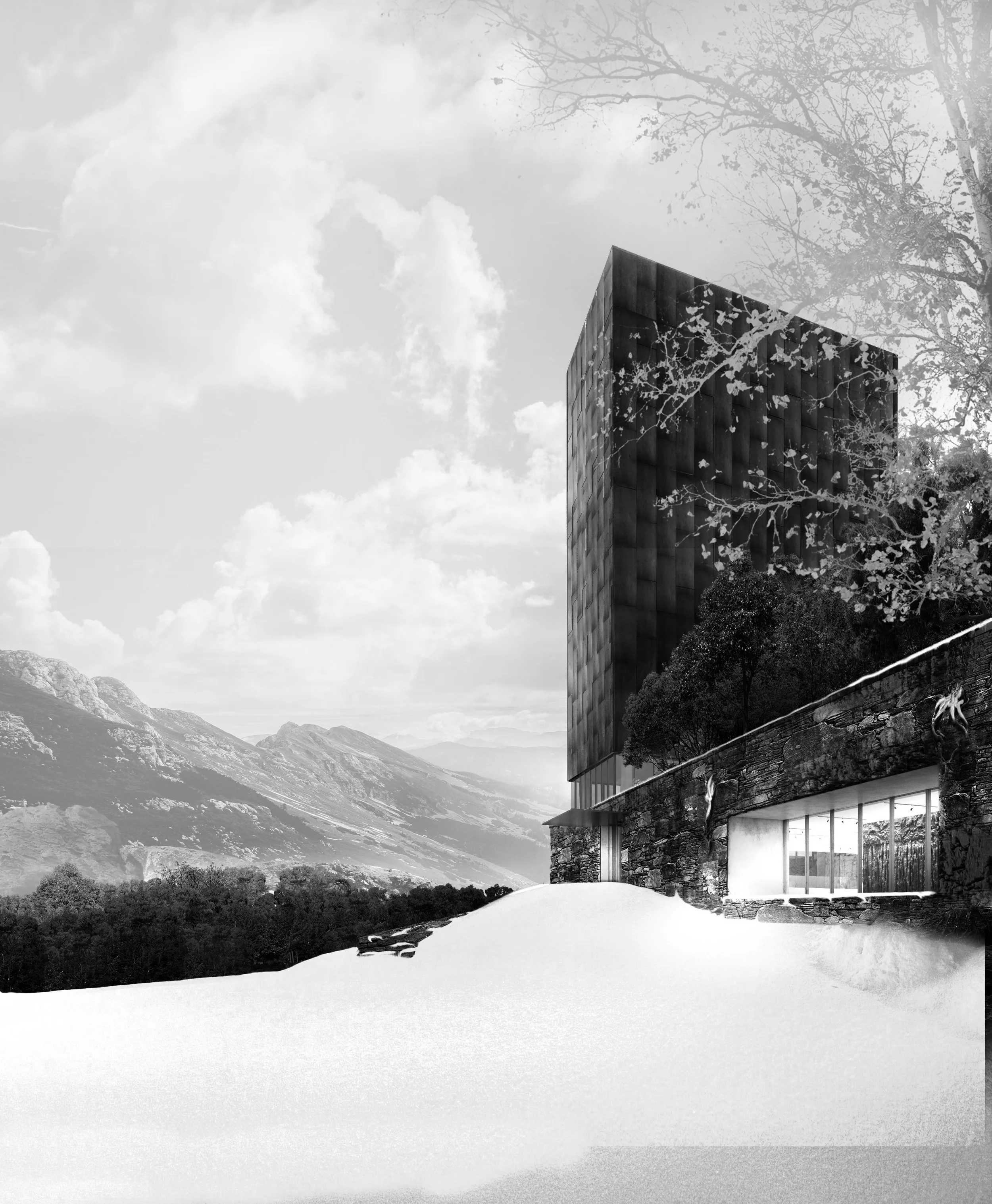
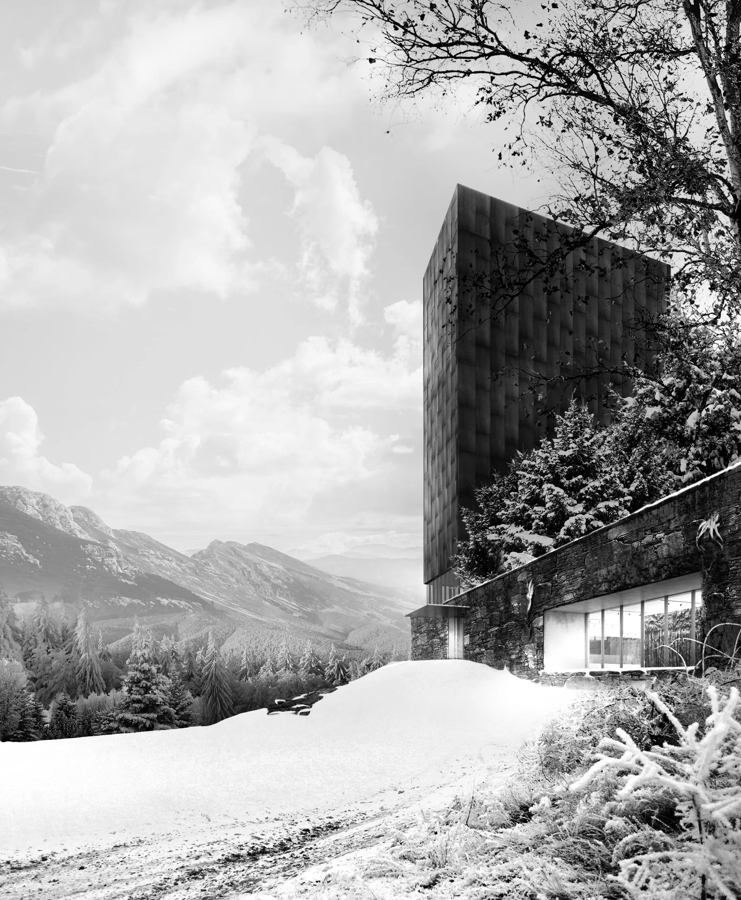
View fullsize
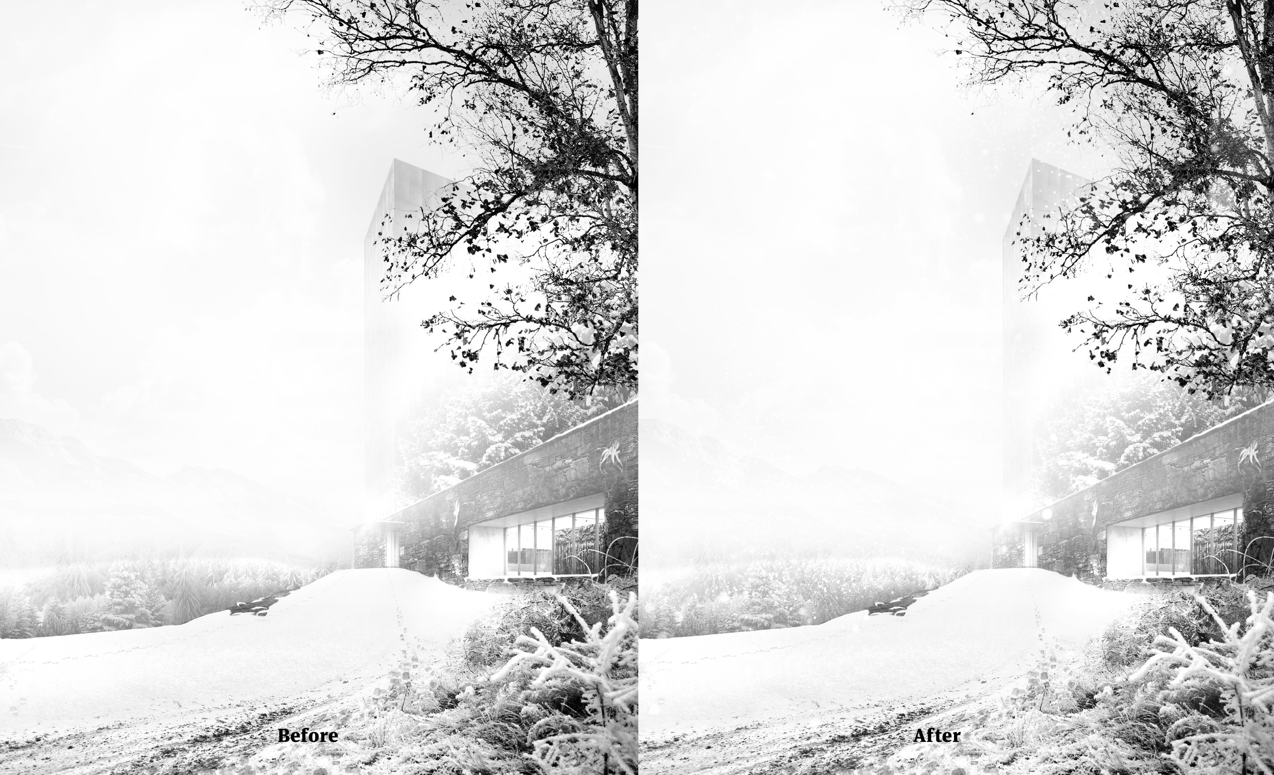
In this case, the falling snow effect is quite subtle. We notice it well in the background near the trees, and in the upper part. Adjusting levels will help in reading our effect better while not making it too strong.
**Two little extra tips** :
- Gaussian blur is an effect you will use a lot. Save time by setting a shortcut for it. I personally use : **Ctrl+Alt+B**. To set a new shortcut, just go into **Edit>Keyboard Shortcuts (Alt+Shift+Ctrl+K)**, and find the gaussian blur effect in the drop down menu and set a shortcut you find convenient.
- You can adjust your gaussian blur intensity even after you've pressed ok. To do so, just convert each of your snowflake layer to a smart object (**Right Click on the name of the layer > Conver to Smart Object**). If you apply a gaussian blur to a smart object, the effect is then added under your smart object layer. To adjust your gaussian blur intensity, just double click on the effect, it will take you straight to the effect panel for further adjustments. Pretty handy!
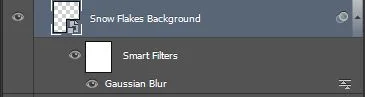
Double click on "Gaussian Blur" to get back to the effect panel for further adjustments
## 7. Adjust Levels and Saturation
Now that our image is sort of finished, we can concentrate on the three last aspects : levels, saturations and colours. First we'll focus on saturations and levels.
To do so we filled a new layer with pure red (R:255 G:0 B:0) and set its blending mode to **luminosity**. In order to isolate saturation, we have to neutralize hue as well. To neutralize hue, we have to fill another layer with pure red (R:255 G:0 B:0) and set its blending mode to **Hue**.
**Hue and Luminosity** being neutralized when we turn both of these layers on, **the only information left is the saturation**. To bring the effect up a bit more, we can use a hue/saturation adjustment layer, put it on top of all these layers, and increase the saturation so that the discrepancy between different levels of saturation are emphasized.
Using this technique, this is what we get for our image.
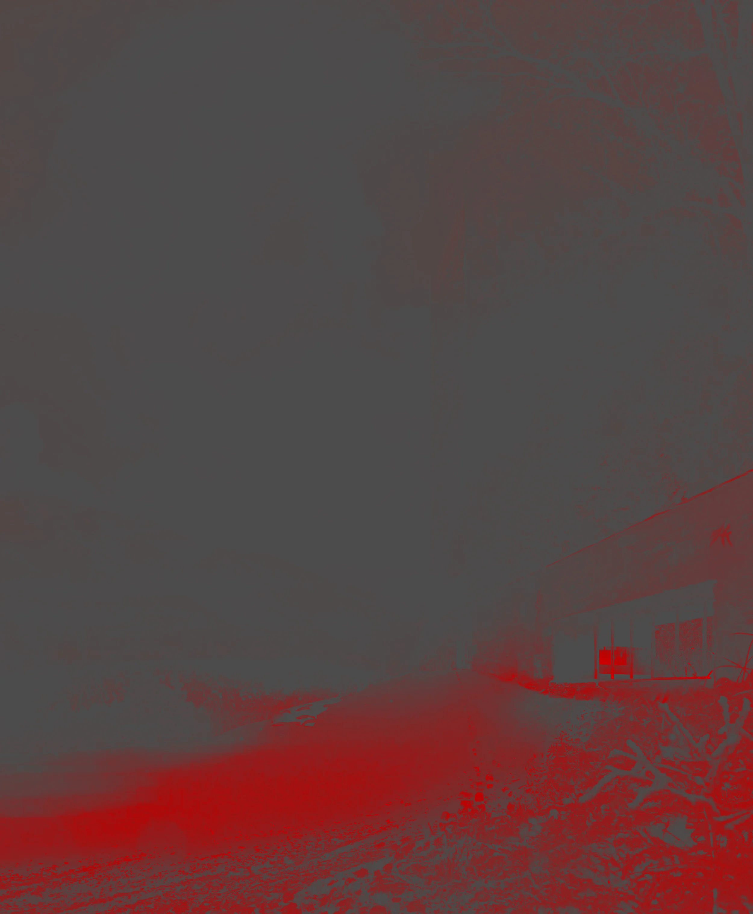
Red parts are the more saturated while grey ones are less or not saturated. This vision makes it much easier to adjust saturation efficiently and precisely
The idea behind all this is that, in real life, saturation levels are homogeneous. Using this technique we can put our finger on inconsistent saturation levels. To correct them, we simply use a hue/saturation adjustment layer, clip it to the affected layer (**Ctrl+Alt+G**), and lower or increase the saturation until the layer blends perfectly in its surroundings. Repeat for each layer whether it's too saturated or not enough.
After saturation adjustments, here's what we get.
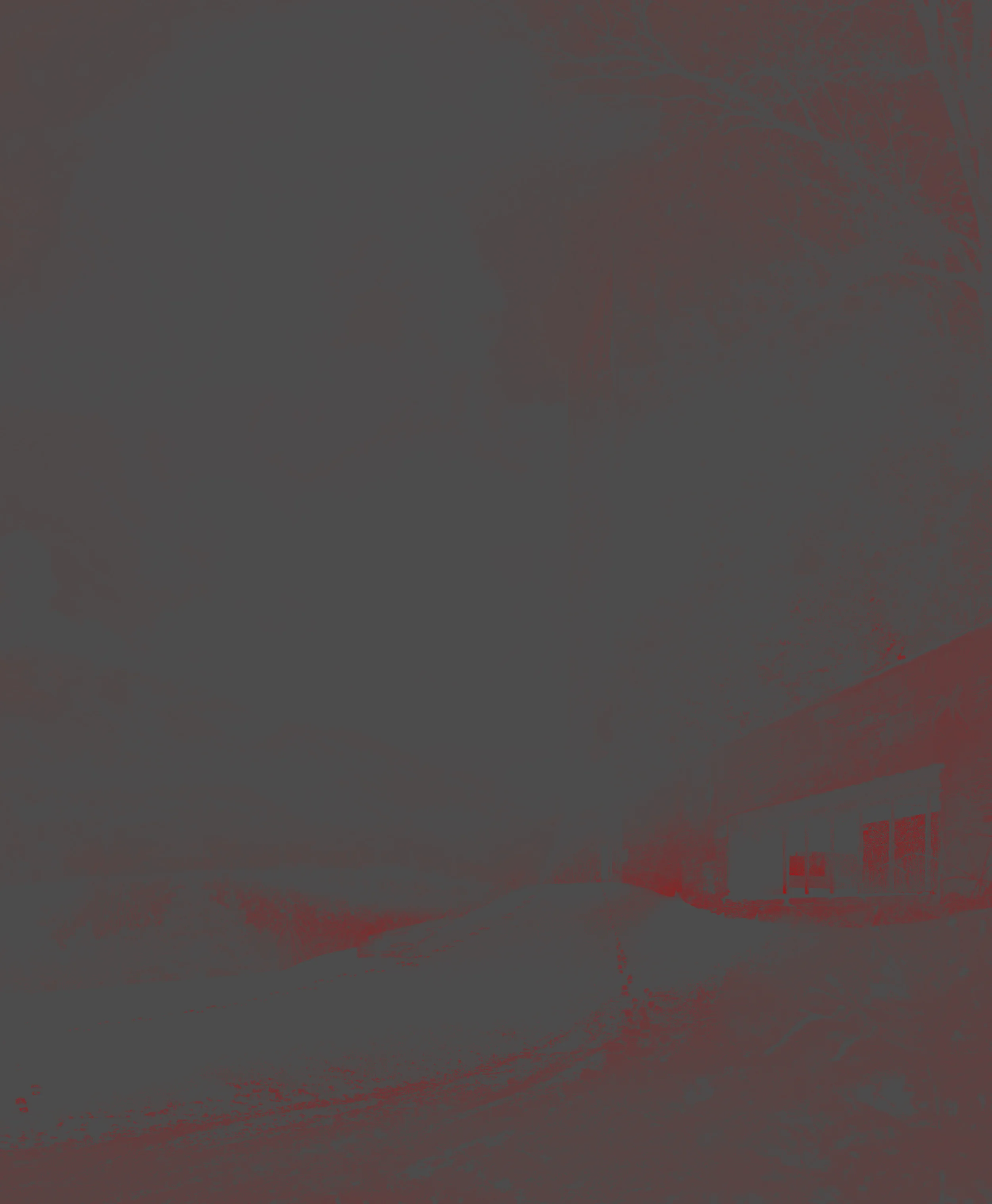
Saturation levels are much more homogeneous and realistic.
## 8. Adjust colours
Final tweak is the colours. We've been working in black and white the whole time and, if we turn of this saturation layer, we'll see that most of our composited images are a bit off. See for yourself on the image below.
This doesn't feel like winter, to say the least.
To get the image on the right side, which is a representation of only the hues of the image, we need to turn on the **hue/saturation adjustment layer** from earlier plus **the red layer set to Luminosity**. With only these two layers activated, the remaining information is only hues.
To adjust the hues, we'll proceed the same as for saturations. For each layer we'll adjust their hues. The good thing is that, since we worked on saturation already, we can use the same hue/saturation adjustment layer to adjust hue.
Ok, but what do we do precisely?
Well, this is up to you. In our case, a winter scene, we know that we'll be more into blueish hues. So we can start there.
Another thing you can do is use reference images and analyse their hues with the new filter you've just created. It then becomes extremely simple to adjust your image in comparison to your reference and get the same hues.
All in all, this all becomes a matter of experience in the end, whether you do it surgically from a reference image, or whether you eyeball it.
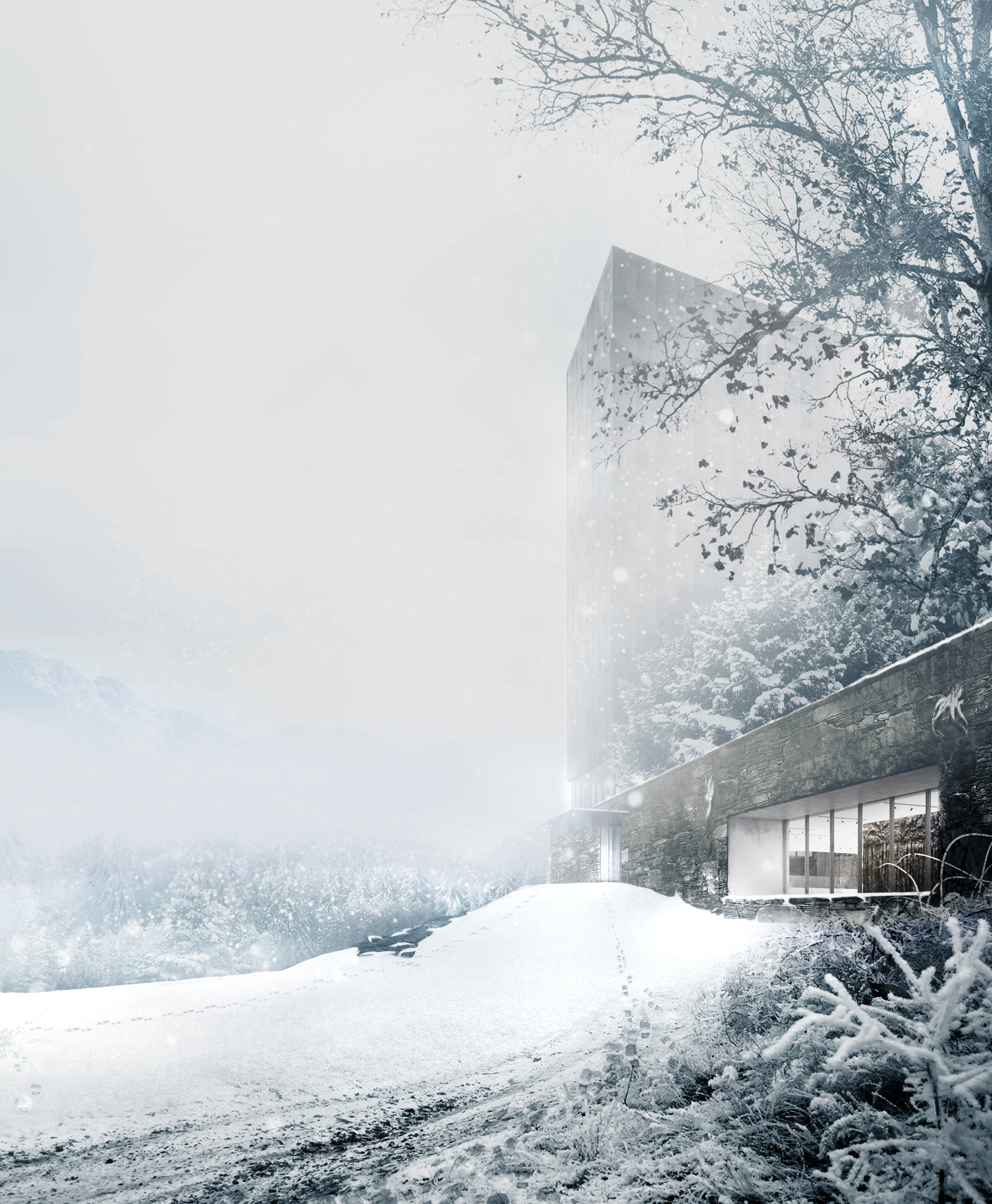
After these adjustments, here's what we get.
Much better, right?
View fullsize
Finally we did it. Hope it wasn't too hard to follow me through all the steps. Don't hesitate to comment and ask questions if need be.
As mentioned earlier, you will find [**all the brushes I've used here for free**](https://gumroad.com/l/yTTTI). Hope this helps!
Also, you can find a breakdown video [**here**](https://www.youtube.com/watch?v=M291XZGcOj4) to get some extra details of the process.
Please like and share this article so that it reaches as many archviz artists as possible. And don't forget to subscribe to our newsletter to get for more tutorials and freebies like this one!